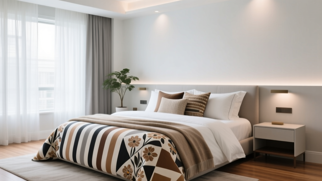
How to Mix Patterns on Your Bed - The Decor Mag
A well-made bed can be a small daily reset button. When the patterns, textures, and colors on your bed feel cohesive, your bedroom design becomes quieter to look at—and that visual calm can support a calmer mind at night. The way your sleep environment looks and feels matters: cluttered visuals, harsh contrast, and overly busy prints can keep your nervous system alert, while a balanced palette and intentional layering can help you wind down.
Mixing patterns is one of the fastest ways to elevate bedding without a full room makeover. It’s also where many homeowners and renters get stuck: you want the warmth of a layered, designer bed, but you don’t want it to look chaotic. The good news is that pattern mixing is less about “rules” and more about gentle structure—repeating a few colors, varying scale, and choosing fabrics that feel good against skin.
Below is a practical, sleep-friendly guide to building a patterned bed that looks curated, feels comfortable, and supports better rest.
Start With the Sleep Foundation: Comfort First, Pattern Second
Before you mix prints, make sure the bed itself supports sleep quality. Your bedding is in constant contact with skin, and temperature comfort is a major factor in staying asleep. Choose materials that breathe, feel pleasant, and launder well.
Best bedding materials for a calmer sleep environment
- Long-staple cotton percale (cool, crisp): Great for hot sleepers and warmer climates; feels hotel-clean and reduces overheating.
- Cotton sateen (smooth, slightly warmer): Softer hand-feel and a gentle sheen; ideal if you like a cozy drape without heavy weight.
- European flax linen (highly breathable): Naturally temperature-regulating; relaxed texture makes pattern mixing look effortless.
- Lyocell/TENCEL™ blends (cooling, silky): Excellent for sensitive skin and moisture control.
- Wool or down-alternative inserts (for duvets): Wool regulates temperature; down-alternative is easier for allergy-sensitive households.
Budget ranges (for building a layered patterned bed)
- Budget: $80–$200 (sheet set + duvet cover + 2 shams; add 1–2 throw pillows over time)
- Mid-range: $200–$500 (higher-quality sheets, better duvet insert, more texture options)
- Investment: $500–$1,200+ (premium linen or long-staple cotton, artisan quilts, multiple inserts)
Sleep-friendly tip: If you’re mixing patterns, keep your base layer (sheets and pillowcases) in a soothing solid or subtle texture. It gives your eyes a place to rest and gives your skin a predictable feel.
The Three-Part Method: Color, Scale, and Spacing
Designer beds look balanced because they manage three things: a limited color story, varied pattern scale, and breathing room between prints.
1) Choose a calm color palette (2–4 colors max)
For a bedroom designed for rest, start with neutrals or muted tones and add one deeper anchor color for depth.
- Soothing neutrals: warm white, ivory, oatmeal, sand, soft gray
- Sleep-friendly hues: dusty blue, sage, muted clay, soft charcoal, lavender-gray
- Anchor tones (use sparingly): deep navy, forest green, espresso, ink black
A simple approach: 70% neutral + 20% muted color + 10% accent. This keeps your bedding decor interesting without feeling visually loud.
2) Mix pattern scales: large, medium, small
Scale is the secret to mixing prints without tension. If everything is the same size, patterns compete. If the scales differ, they cooperate.
- One large-scale pattern: bold floral, wide stripe, oversized plaid (often best on a duvet cover or quilt)
- One medium pattern: block print, mid-check, classic ticking stripe (great on shams)
- One small pattern: micro-stripe, dot, tiny geometric (excellent for throw pillows or a subtle sheet print)
3) Add “spacing” with solids and texture
Not every layer needs a print. Solids and textured weaves create visual quiet—especially helpful for a sleep environment.
- Textured solids to try: matelassé coverlets, waffle weaves, quilted cotton, brushed cotton, linen
- Pattern breaks: solid euro shams behind patterned shams; solid sheet set under a printed duvet
Build the Bed in Layers (A Practical Blueprint)
Layering makes pattern mixing feel intentional. Use this structure whether you have a king bed or a studio apartment full-size.
Layer 1: Sheets and pillowcases (the comfort layer)
Choose a solid or very subtle pattern (like a micro-stripe) in a breathable fabric.
- Hot sleepers: cotton percale or TENCEL™
- Cool sleepers: cotton sateen, brushed cotton in winter
- Sensitive skin: smooth sateen or TENCEL™; avoid scratchy decorative trims
Layer 2: Duvet cover or quilt (the main pattern moment)
This is your “hero” piece. If you want a patterned bed, place the strongest print here so it looks deliberate.
- Best hero patterns for bedrooms: soft florals, watercolor botanicals, wide stripes, gentle geometrics
- Sleep-friendly tip: Choose lower-contrast prints (cream + blue, oatmeal + sage) for a calmer visual field.
Layer 3: Shams (the pattern mixer)
Use shams to introduce your second pattern or a textured solid. Shams are easier to swap seasonally than a duvet cover, making them great for renters or anyone on a budget.
- Easy combo: patterned duvet + solid euro shams + striped standard shams
- Texture option: linen euro shams behind a crisp cotton print
Layer 4: Throw blanket (the grounding layer)
A throw adds warmth and helps the bed feel inviting. For sleep wellness, it can also become a practical nap layer without fully remaking the bed.
- Materials: cotton knit, linen blend, lightweight wool, soft fleece (if you like plush)
- Placement: fold across the foot for structure, or drape diagonally for relaxed styling
Layer 5: Throw pillows (the finishing accents)
Keep throw pillows minimal for a cleaner sleep environment—especially if you dislike removing many items at bedtime.
- Best practice: 1–3 decorative pillows max
- Use them for: the smallest pattern, a pop of accent color, or a textured neutral
Pattern Pairings That Always Look Good (and Feel Calm)
If you want a shortcut, start with these tried-and-true combinations. Each one works well in a restful bedroom design because it balances movement and simplicity.
Stripe + floral
- How: wide stripe duvet + small floral sham (or vice versa)
- Why it works: stripes add order; florals add softness
Plaid/check + solid texture
- How: check duvet + matelassé coverlet or linen shams
- Why it works: the texture acts like a “visual exhale”
Geometric + organic print
- How: subtle geometric quilt + botanical throw pillow
- Why it works: structured + natural feels balanced and modern
Block print + ticking stripe
- How: block-print duvet + ticking stripe shams in the same color family
- Why it works: both feel classic; the stripe keeps it tailored
Bedroom Design Details That Make Pattern Mixing Look Intentional
Your bed doesn’t exist in isolation. Lighting, furniture, and layout influence whether patterns feel serene or busy.
Furniture recommendations (especially for renters)
- Headboard (or wall alternative): Upholstered headboards in oatmeal, gray, or linen-look fabric soften patterned bedding. Budget-friendly alternatives include a wood headboard, a neutral peel-and-stick panel behind the bed, or a fabric wall hanging.
- Nightstands: Choose simple shapes and calm finishes (light oak, walnut, matte white). If your bedding is patterned, avoid heavily patterned nightstands.
- Bench or trunk at the foot: Useful for placing extra pillows at night, reducing bedroom clutter and making the space feel more sleep-friendly.
Lighting that supports a restful sleep environment
- Bedside lamps: warm bulbs (2700K), preferably dimmable
- Shades: linen or paper shades soften contrast and reduce glare
- Avoid: cool white LEDs and overhead-only lighting, which can make patterns feel harsh and can interfere with wind-down cues
Color and wall support
- If your bedding is busy: keep wall color soft (warm white, pale greige, misty blue)
- If your walls are bold: choose bedding patterns with more negative space and fewer colors
Sleep-Friendly Pattern Mixing: Wellness Tips That Actually Help
Pattern mixing should make your bedroom feel nurturing, not stimulating. A few wellness-minded choices can keep the look elevated while supporting deeper rest.
- Reduce visual noise near the pillow area: Keep the top sheet and primary pillowcases mostly solid. This makes the “sleep zone” feel calmer.
- Prioritize breathable layering: Instead of one heavy blanket, use a duvet plus a lightweight quilt or throw so you can adjust temperature easily.
- Choose softer contrast for bedtime: Black-and-white high-contrast patterns can look graphic but may feel energizing. Try ink + ivory, charcoal + oat, or navy + cream for a gentler effect.
- Keep bedtime setup simple: If you dislike removing many pillows, limit decorative pillows and use shams that can stay on the bed while you sleep.
- Opt for low-scent laundering: Strong fragrances can be irritating for some sleepers. Use fragrance-free detergent and a gentle fabric refresher if needed.
Common Mistakes to Avoid When Mixing Patterns on Your Bed
- Using too many unrelated colors: If each pattern introduces a new color, the bed can feel chaotic. Repeat the same 2–4 tones throughout.
- Keeping all patterns the same scale: Three medium-scale prints compete. Mix large, medium, and small.
- Overloading the bed with throw pillows: It looks styled, but it can become nightly clutter and disrupt a relaxing sleep routine.
- Choosing scratchy “decorative” fabrics: Sequins, rough embroidery, and stiff trims don’t belong near your face. Keep tactile comfort at the top of the list.
- Ignoring undertones: Mixing a cool gray pattern with warm cream sheets can feel “off.” Match undertones (warm with warm, cool with cool) for a smoother look.
- Forgetting the rest of the room: If your rug, curtains, and bedding all have strong patterns, the room can feel restless. Let one area lead and keep the others quieter.
FAQ: Mixing Patterns on Your Bed
How many patterns should I use on a bed?
For most bedrooms, 2–3 patterns is the sweet spot. Add solids and texture to create depth without visual overload.
Can I mix florals and stripes without it looking messy?
Yes. Keep them in the same color family and vary the scale—like a large stripe with a small floral. Add a solid or textured layer in between to create breathing room.
What if my bedroom is small—should I avoid patterns?
You don’t need to avoid them. Choose lower-contrast patterns with more negative space and limit the palette to 2–3 colors. A patterned duvet with solid sheets often looks calm even in a compact room.
What’s the easiest budget-friendly way to update my bedding decor?
Swap shams and throw pillow covers first. They’re usually less expensive than a new duvet cover and can instantly refresh your bedroom design. Expect $20–$80 per cover depending on fabric and brand.
Do patterned sheets affect sleep quality?
The pattern itself doesn’t change sleep, but the visual intensity and fabric comfort can. If bold prints feel stimulating, keep sheets solid and place patterns on the duvet or shams instead. Always prioritize breathable, skin-friendly materials.
How do I make mismatched bedding look intentional?
Repeat one color across at least two items (for example, navy in the duvet and a pillow), add a textured neutral, and keep the number of patterns to three or fewer.
Actionable Next Steps for a Calm, Patterned Bed
- Pick your palette: choose 2 neutrals + 1 muted color (and optionally 1 accent).
- Select your hero pattern: duvet cover or quilt in a low-contrast print.
- Add one supporting pattern: shams in a stripe, check, or small-scale geometric.
- Ground it with texture: a matelassé coverlet, linen euro shams, or a cotton knit throw.
- Keep it sleep-friendly: breathable fabrics, warm lighting, and a pillow setup you’ll actually maintain nightly.
A thoughtfully layered bed can make your whole sleep environment feel more soothing—helping your mind settle down as your body gets ready for rest. For more calming bedroom ideas, bedding guides, and decor inspiration designed around better sleep, explore the latest articles on thedecormag.com.
More Articles
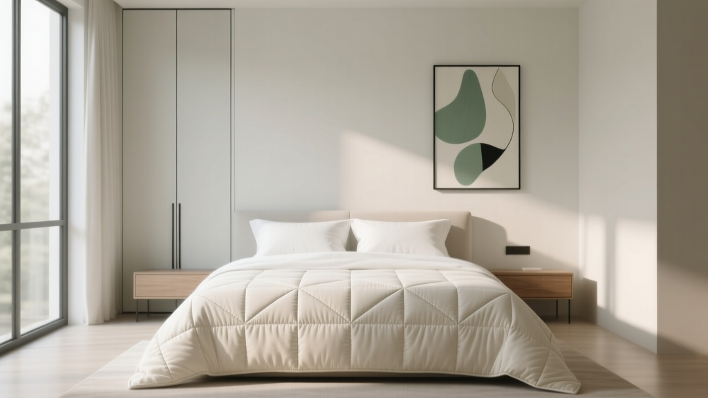 How to Choose Bedroom Quilt Style - The Decor Mag
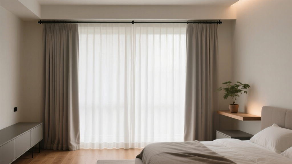 How to Choose Bedroom Curtain Length - The Decor Mag
 Bedroom Layout Common Mistakes: What 92% of Homeowners Get Wrong (And How to Fix Them)
 Minimalist Bedroom Design Guide - The Decor Mag
 Bedroom Warm Wood Nightstand Pair - The Decor Mag
 Best Bedroom Sleep Weighted Blanket Guide - The Decor Mag
 How to Style a Bed Like a Hotel - The Decor Mag
 Natural Bedroom Materials: Stylish Ideas for 2026
 Bedroom Fluted Nightstand with Stone Top - The Decor Mag
 Best Bedroom Sleep Journal Writing Prompts - The Decor Mag