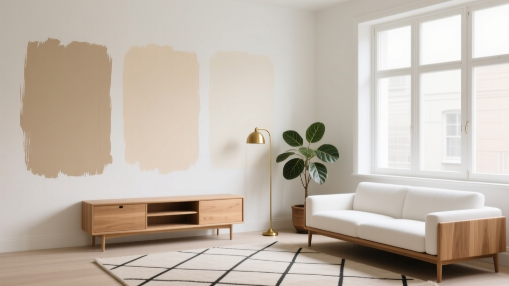
Best Beige Paint Colors That Aren't Boring - The Decor Mag
Beige gets a bad reputation because it’s often treated like a default—something chosen to “play it safe,” then applied without considering undertones, lighting, or the room’s fixed finishes. The truth: beige is one of the most flexible, design-forward neutrals you can use. When you choose the right beige paint color, you get warmth without yellowing, softness without dullness, and a background that makes wood, stone, textiles, and art look richer.
Beige also solves a real-world design problem for homeowners: many homes have a mix of warm and cool elements (oak floors, gray tile, creamy trim, stainless appliances). The right beige acts as a bridge, creating a cohesive color scheme without forcing you into a trend that may feel dated in a few years.
From a color psychology perspective, beige supports calm, comfort, and approachability—ideal for living rooms, bedrooms, hallways, and open-concept spaces where you want the mood to feel welcoming. The key is choosing a beige with the right undertone and using it intentionally with contrast, texture, and lighting.
What Makes a Beige Paint Color “Not Boring”?
Beige becomes exciting when it has complexity: a balanced undertone, enough depth to hold its own, and a supporting cast of complementary materials. A “not boring” beige usually does at least one of these things:
- Has a clear undertone (greige, rosy beige, taupe-beige, sandy beige) that reads sophisticated instead of flat.
- Creates contrast with crisp trim, dark metals, or deeper accent colors.
- Plays well with natural materials like linen, leather, rattan, oak, travertine, or brushed brass.
- Adapts to shifting light without turning muddy or overly yellow.
Undertones: The Beige Dealbreaker
When people say “beige went yellow” or “beige looks gray and sad,” they’re usually reacting to undertones. Common undertone families include:
- Yellow/golden beige: cozy, traditional, can skew buttery in low light.
- Pink/rosy beige: flattering, soft, great with warm woods; can read peachy in very warm light.
- Green-beige (khaki): earthy and modern; can look drab if paired with cool grays.
- Greige-beige: balanced, transitional; can feel cooler than expected in north-facing rooms.
LRV and Why It Matters for Beige
LRV (Light Reflectance Value) measures how much light a color reflects. For beige paint colors:
- LRV 70+: airy and bright, can wash out in strong sun.
- LRV 55–70: versatile “whole-home” range—enough warmth with noticeable color.
- LRV under 55: grounded and cozy, better for bedrooms, dens, or dramatic dining rooms.
Best Beige Paint Colors That Feel Fresh (Not Flat)
These beige paint colors are widely used by designers because they’re flexible, layered, and dependable across a range of lighting conditions. Always sample first—beige is highly reactive to surrounding finishes.
1) Benjamin Moore Classic Gray (OC-23) — Soft, Airy, Elevated
Despite the name, Classic Gray reads as a very light warm greige-beige. It’s a strong choice for open concept spaces where you want brightness without stark white.
- Best for: living rooms, hallways, north-facing spaces that need gentle warmth
- Pairs well with: white oak, matte black accents, linen textiles
- Try this combo: Classic Gray walls + Benjamin Moore White Dove trim + warm oak floors
2) Benjamin Moore Natural Cream (OC-14) — Creamy Without Looking Yellow
Natural Cream is a classic beige-leaning cream that feels welcoming and “sunlit.” It’s especially good if you have warm cabinetry, warm stone, or honey-toned wood.
- Best for: kitchens, family rooms, traditional homes
- Pairs well with: brushed brass, warm whites, terracotta accents
- Room idea: Natural Cream walls + creamy quartz counters + woven pendants for a relaxed kitchen
3) Sherwin-Williams Accessible Beige (SW 7036) — The Classic Greige-Beige Bridge
Accessible Beige is popular for a reason: it’s balanced and reads warm without becoming tan. It’s a reliable “whole-home neutral” when your finishes are mixed.
- Best for: open floor plans, homes with both warm wood and cool tile
- Pairs well with: crisp white trim, charcoal accents, natural stone
- Try this combo: Accessible Beige walls + SW Pure White trim + deep olive cabinetry
4) Sherwin-Williams Natural Linen (SW 9109) — Beige with a Modern, Slightly Green Edge
Natural Linen has a soft khaki-beige character that reads grounded and current. It’s beautiful in rooms with lots of texture: linen drapery, jute rugs, boucle upholstery.
- Best for: bedrooms, home offices, calm living rooms
- Pairs well with: warm whites, clay tones, walnut wood
- Room idea: Natural Linen walls + creamy bedding + walnut nightstands for a boutique-hotel feel
5) Farrow & Ball Skimming Stone (No. 241) — Sophisticated, Warm, Stone-Like Beige
Skimming Stone is a designer favorite for its refined, plaster-like warmth. It reads elegant rather than “builder beige,” especially with detailed trim or traditional architecture.
- Best for: dining rooms, formal living rooms, older homes with character
- Pairs well with: aged brass, deep greens, warm whites
- Try this combo: Skimming Stone walls + dark olive accents + vintage-inspired lighting
6) Farrow & Ball Drop Cloth (No. 283) — Earthy, Relaxed, Slightly Deeper Beige
Drop Cloth brings a grounded warmth that feels effortless. It’s fantastic in spaces where you want coziness without going dark.
- Best for: dens, mudrooms, cozy living rooms
- Pairs well with: soft black, cognac leather, warm whites
- Room idea: Drop Cloth walls + leather sofa + antique wood coffee table for a lived-in look
7) Behr Wheat Bread (720C-3) — Warm, Inviting, Budget-Friendly
Wheat Bread is a friendly, warm beige that works well when you want a noticeable beige presence (not barely-there). It’s a great option for rentals and quick refreshes.
- Best for: living rooms, kid-friendly homes, transitional spaces
- Pairs well with: warm white trim, denim blues, soft greens
- Try this combo: Wheat Bread walls + creamy trim + medium blue accents for fresh contrast
Real Room Examples: Where Beige Looks Anything But Basic
Living Room: Layered Neutrals with Contrast
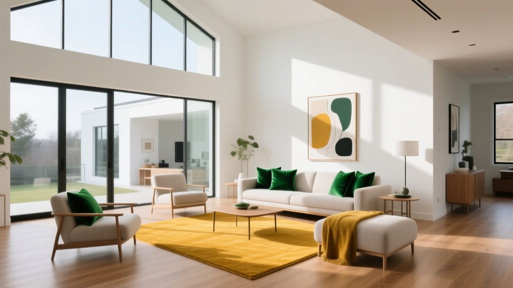
A beige living room feels intentional when you build contrast and texture into the color scheme. Think: beige walls, a slightly deeper rug, and a darker accent to anchor the space.
- Wall color: Sherwin-Williams Accessible Beige
- Trim: Sherwin-Williams Pure White
- Accents: black metal, walnut wood, warm white upholstery
- Color pop options: muted navy, forest green, ochre
Bedroom: Soft, Flattering Beige for a Calm Mood
Beige is naturally soothing, making it ideal for bedrooms. Rosier or linen-like beiges tend to feel especially flattering under lamplight.
- Wall color: Sherwin-Williams Natural Linen
- Bedding: creamy whites + a sand or clay throw
- Wood tones: walnut or medium oak
- Tip: add one deep shade (espresso, deep olive, ink blue) to prevent the room from feeling washed out
Kitchen: Beige as the “Quiet Luxury” Backdrop
Beige kitchens feel warm and timeless, especially with stone counters and aged metals. Beige works beautifully when you want a softer alternative to stark white.
- Wall color: Benjamin Moore Natural Cream
- Cabinet pairing: creamy white cabinets or warm greige lowers
- Hardware: unlacquered brass or champagne bronze
- Stone pairing: quartz with warm veining or honed limestone look
Bathroom: Beige Done Clean, Not Dingy
Bathrooms can make beige look muddy if lighting is too cool. The fix is choosing a beige with enough clarity and pairing it with crisp trim and bright, high-CRI lighting.
- Wall color: Benjamin Moore Classic Gray
- Trim: Benjamin Moore White Dove
- Finishes: polished nickel, warm white towels, natural wood vanity accents
Winning Color Combinations with Beige (Designer-Approved)
Beige is a team player. Use these pairings to build a polished interior color scheme:
- Beige + crisp white: clean, tailored, great for trim and ceilings
- Beige + deep green: earthy sophistication (olive, forest, moss)
- Beige + navy: classic contrast that feels upscale
- Beige + terracotta: warm, Mediterranean, inviting
- Beige + charcoal/soft black: modern edge, strong definition
For a cohesive palette, try the 60-30-10 approach:
- 60%: beige wall color
- 30%: secondary neutral (cream, warm gray, or wood tone)
- 10%: accent color (green, navy, clay, black)
Practical Tips for Choosing the Right Beige Paint
- Sample large: use a sample or peel-and-stick swatch in multiple areas of the room.
- Check at different times: morning, afternoon, and evening light can shift beige dramatically.
- Match beige to fixed finishes: floors, counters, tile, and upholstery determine what undertones will look “right.”
- Use the right sheen:
- Walls: eggshell or matte (matte hides imperfections; eggshell is easier to clean)
- Trim: satin or semi-gloss for a crisp frame
- Ceilings: flat for a softer, taller feel
- Upgrade lighting: choose high CRI bulbs (90+) so beige reads true, not sallow or gray.
Common Beige Paint Mistakes (and How to Avoid Them)
- Mistake: Choosing beige without testing undertones.
Fix: Compare your beige sample against a true white and a warm gray—undertones become obvious. - Mistake: Pairing warm beige with cool gray tile.
Fix: Use a greige-beige bridge color (like Accessible Beige) or warm up the space with wood and warmer lighting. - Mistake: Using beige everywhere with no contrast.
Fix: Add definition with trim color, darker accents, or a deeper adjacent room color (olive, charcoal, navy). - Mistake: Ignoring the room’s direction and natural light.
Fix: In north-facing rooms, avoid beiges that are too gray. In south-facing rooms, be wary of beiges that go overly golden. - Mistake: Picking a beige that matches the carpet too closely.
Fix: Create separation: either go lighter on walls with crisp trim or choose a slightly deeper wall shade for intentional layering.
FAQ: Beige Paint Colors and Interior Color Design
Is beige still in style for interior walls?
Yes. Beige is a core neutral in modern interior design because it supports warmth, natural materials, and timeless color schemes. Today’s beiges lean more nuanced—greige, linen, and stone-inspired tones that feel tailored rather than bland.
What’s the difference between beige and greige?
Beige typically has more warmth (yellow, pink, or golden undertones). Greige blends beige with gray, often reading more muted and modern. If your home has mixed finishes, greige-beige shades can be the most forgiving.
Which beige paint color works best in a north-facing room?
North-facing light can make colors look cooler. Look for beiges with a soft warmth and avoid overly gray options. Benjamin Moore Natural Cream or a warm greige like Sherwin-Williams Accessible Beige often performs well, depending on your finishes.
How do I keep beige walls from looking yellow?
Choose a beige with balanced undertones and test it under your lighting. Pair it with a clean white trim (not a creamy yellow-white), and use high-CRI bulbs. Also watch for nearby warm elements—golden floors and warm LED lighting can push beige warmer.
What trim color looks best with beige walls?
Most beige wall colors look sharp with a versatile white like Benjamin Moore White Dove or Sherwin-Williams Pure White. If your beige is very warm, avoid an overly creamy trim; if your beige leans greige, a crisp white keeps it fresh.
Can beige work with black windows and modern finishes?
Absolutely. Beige creates a warm contrast against black windows, black hardware, and modern lighting. Choose a beige with enough depth (not too pale) so it doesn’t look washed out next to strong black lines.
Your Next Steps: Choose Beige Like a Designer
Start by identifying your room’s fixed finishes (flooring, tile, countertops), then pick 3 beige paint colors with different undertones—one warmer, one more neutral, one slightly deeper. Sample them on multiple walls, view them in day and night lighting, and choose the one that looks consistent and flattering. Finish the look with contrast (trim, metals, accent colors) and texture (linen, wool, wood) so your beige reads layered and intentional.
For more paint color ideas, undertone guides, and room-by-room color schemes, explore more color guides on thedecormag.com.
More Articles
 Best Scarlet Paint Colors - The Decor Mag
 Best Key Lime Paint Colors - The Decor Mag
 Best Yellow Paint Colors for Cheerful Rooms - The Decor Mag
 Reading FAQ Answered: Evidence-Based Answers to 27 Common Questions About Vision, Eye Health, and Reading Performance
 Best Cherry Red Paint Colors - The Decor Mag
 Best Jade Green Paint Colors - The Decor Mag
 How to Use Undertones to Match Colors - The Decor Mag
 Best Burgundy Paint Colors - The Decor Mag
 How to Choose Bedroom Colors for Sleep - The Decor Mag
 2026 Color Trends: Earth Tones Making a Comeback