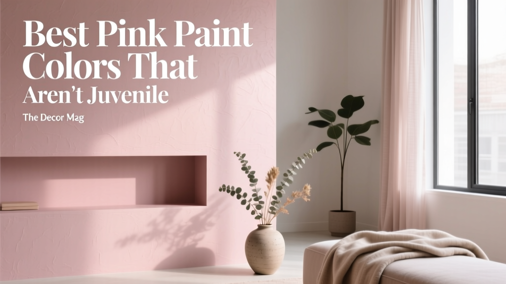
Best Pink Paint Colors That Aren't Juvenile - The Decor Mag
Pink has a reputation problem. For decades it was boxed into “baby girl nursery,” “bubblegum,” or “princess bedroom,” which makes many homeowners shy away from it—even when they love the warmth and glow pink can bring to a space. The truth is that grown-up pink paint colors exist in every design style, from modern minimal to traditional, and they can read as sophisticated as any neutral when chosen with the right undertone, finish, and pairing.
Designers keep returning to pink because it’s flattering, mood-lifting, and surprisingly versatile. Color psychology links pink with comfort and care, but when it’s muted or complex (think dusty rose, blush-beige, or terracotta pink), it also signals calm confidence. If you want a home that feels welcoming without feeling saccharine, pink can be the secret weapon—especially in rooms that need warmth, softness, or a better complexion under artificial light.
This guide breaks down the best pink paint colors that don’t feel juvenile, how to use them in real rooms, and what mistakes to avoid—so you can build a polished pink color scheme that suits your home and your lifestyle.
What Makes a Pink Paint Color Feel Sophisticated?
“Adult” pink is rarely a pure pink. The best designer-favorite pink paint colors include complex undertones—beige, gray, brown, peach, or mauve—that mute the sweetness and add depth. These are the qualities to look for when sampling:
- Muted saturation: Dusty, “toned” pinks feel calmer and more refined than bright, candy pinks.
- Complex undertones: Beige-based blush reads like a neutral; mauve-based pink reads elegant and moody.
- Right light behavior: South-facing rooms can make pinks look warmer; north-facing rooms can pull them gray or lilac.
- Finish choice: Matte or eggshell typically looks more modern; high-gloss can feel intentional and editorial when used selectively.
Quick Undertone Decoder
- Blush + beige: Soft neutral, great for open-concept homes and hallways.
- Dusty rose + gray: Tailored, calm, works beautifully with black accents and modern furniture.
- Mauve + violet: Moody, romantic, best in bedrooms, powder rooms, and libraries.
- Terracotta pink (pink + brown/orange): Earthy and grounded, ideal with natural wood and warm metals.
Best Pink Paint Colors That Read Grown-Up (With Brand Picks)
Below are specific pink paint color recommendations that designers and homeowners reach for when they want a polished look. Always test with a sample or peel-and-stick swatch—pink is especially sensitive to lighting and surrounding finishes.
1) Soft Blush Neutrals (Pink That Behaves Like a Neutral)
Benjamin Moore First Light (2102-70)
An airy blush that feels modern and serene. It’s light enough to function like an off-white but adds warmth and softness—ideal for people who “don’t do color” but want something more personal.
Sherwin-Williams Intimate White (SW 6322)
A gentle, creamy pink-white that’s flattering in bedrooms and living rooms. It pairs well with linen textures and warm wood.
Farrow & Ball Pink Ground (No. 202)
A refined blush with subtle warmth. This one shines in traditional homes and rooms with detailed trim.
Where these work best:
- Open-plan living spaces (especially when you want a cohesive neutral palette)
- Hallways and stairwells that feel cold or shadowy
- Guest rooms where you want a universally appealing glow
2) Dusty Rose and “Makeup Pink” (Tailored, Not Sweet)
Benjamin Moore Proposal (AF-260)
A mature, muted rose with enough depth to feel cozy without going fuchsia. This is a smart pick for dining rooms and offices.
Sherwin-Williams Romance (SW 6323)
A soft rose that leans classic rather than trendy. It looks especially good with brass lighting and creamy whites.
Farrow & Ball Setting Plaster (No. 231)
Often described as the “perfect grown-up pink.” It shifts with the light—sometimes peachy, sometimes muted blush—creating an elegant, lived-in look.
Designer pairing ideas:
- Trim: warm white (Benjamin Moore White Dove OC-17, Sherwin-Williams Alabaster SW 7008)
- Accents: aged brass, smoked glass, walnut, and blackened steel
- Textiles: oatmeal linen, camel leather, and rust velvet
3) Mauves and Rose-Gray Pinks (Moody Sophistication)
Benjamin Moore Mauve Desert (2113-50)
A rose-gray that feels calm and architectural. This is a fantastic option if you like pink but worry about it becoming “girly.”
Sherwin-Williams Rose Colored (SW 6303)
A muted rose with a dusty, slightly gray cast that reads cozy and elevated—great for bedrooms and reading nooks.
Farrow & Ball Sulking Room Pink (No. 295)
Despite the name, it’s famously complex—more like a muted, rose-taupe that can appear beige or mauve depending on lighting. One of the best pink paint colors for grown-up spaces.
Best rooms for mauves:
- Primary bedrooms (especially with layered neutrals and soft lighting)
- Powder rooms (for a flattering, candlelit vibe)
- Libraries and studies (paired with deep woods and warm metals)
4) Earthy Terracotta Pinks (Warm, Modern, Grounded)
Benjamin Moore Soft Sand (2106-60)
A warm, blush-beige that hints pink without announcing it. Works beautifully with oak floors and woven textures.
Sherwin-Williams Redend Point (SW 9081)
A clay-rose neutral that reads contemporary and calming. It’s excellent for whole-home color schemes where you want warmth without going tan.
Farrow & Ball Dead Salmon (No. 28)
An iconic earthy pink with historical depth. It looks amazing in dining rooms, entryways, and spaces with classic millwork.
Pair these with:
- Off-whites and creamy ivories
- Olive and sage greens
- Natural stone, travertine, and warm marbles
Real Room Scenarios: How to Use Pink Without It Feeling Childish
Living Room: Pink as a New Neutral
If you want your living room to feel inviting but not beige, try a blush-neutral on the walls and keep the larger pieces grounded. A color like Farrow & Ball Setting Plaster or Benjamin Moore First Light can replace the typical greige while still working with most furniture styles.
- Wall color: soft blush
- Trim: warm white
- Anchor pieces: camel leather sofa or charcoal upholstery
- Accents: walnut coffee table, black frames, brass floor lamp
Bedroom: A Calming, Flattering Pink Sanctuary
Pink’s psychology leans soothing and nurturing—perfect for bedrooms. For an adult look, choose muted mauves or rose-grays and use layered neutrals for bedding. Try Farrow & Ball Sulking Room Pink or Benjamin Moore Mauve Desert for a soft, cocooning effect.
- Paint walls in a mauve-leaning pink to avoid “cotton candy” vibes.
- Add crisp contrast with warm-white sheets and a textured ivory duvet.
- Bring in depth with espresso wood nightstands or black metal lighting.
Dining Room: Pink That Feels Like Candlelight
Dining rooms can handle richer color because they’re often used in the evening. Dusty rose and terracotta pinks look incredible under warm bulbs, creating a flattering glow. Consider Benjamin Moore Proposal or Farrow & Ball Dead Salmon.
- Best finishes: eggshell on walls for gentle sheen; satin on trim for easy cleaning
- Tabletop materials: dark wood, marble, or black-stained oak
- Metal finishes: antique brass, bronze, or matte black
Bathroom or Powder Room: Small Space, Big Impact
Pink is famously flattering in bathrooms because it counteracts the greenish cast of some LEDs and makes skin tones look healthier. For a modern powder room, pair a rose-gray with black accents and a graphic mirror. Try Sherwin-Williams Rose Colored or Sherwin-Williams Redend Point for warmth.
Pro tip: If your bathroom has cool gray tile, avoid blue-based pinks that can turn lavender. Choose beige-based blush or earthy clay rose instead.
Pink Color Schemes That Look Designer-Approved
Pink works best when it’s part of a deliberate color scheme. Use these combinations as a starting point:
- Pink + warm white + brass: Soft, classic, and timeless
- Pink + olive green + natural wood: Earthy, modern, and grounded
- Pink + charcoal + black accents: Crisp contrast that reads tailored
- Pink + navy + cream: Traditional with a fresh twist
- Pink + terracotta + rust: Tonal warmth for a cozy, Mediterranean feel
Trim and Ceiling Colors That Keep Pink Sophisticated
- Warm white trim: Benjamin Moore White Dove (OC-17), Sherwin-Williams Alabaster (SW 7008)
- Soft neutral ceilings: try a ceiling color 50% lighter than the wall color for a seamless look
- When to go crisp white: only if your pink is beige-based; crisp white can make some mauves feel purple
Common Pink Paint Mistakes (and How to Avoid Them)
- Mistake: Choosing a pink that’s too “clean.”
Fix: Look for dusty, gray-leaning, or beige-leaning pink paint colors for a more adult feel. - Mistake: Testing paint in only one spot.
Fix: Paint large swatches on multiple walls (or use peel-and-stick samples). Pink can shift dramatically from morning to evening. - Mistake: Pairing pink with icy grays.
Fix: Choose warm grays (greige), creamy whites, or deeper contrasts like charcoal and navy. - Mistake: Using cool LED bulbs.
Fix: Use warm lighting (2700K–3000K) to keep pink from looking chalky or purplish. - Mistake: Overloading a room with pink.
Fix: Balance with grounding elements: dark wood, black accents, natural stone, or structured textiles.
Practical Tips for Choosing the Right Pink Paint Color
- Start with what won’t change: flooring, tile, countertops, and large furniture. Pull undertones from these fixed finishes.
- Decide the role of pink: do you want it to read as a neutral backdrop (blush-beige) or a statement (dusty rose/mauve)?
- Sample in the right finish: color can look different in matte vs eggshell. If you plan eggshell, sample eggshell.
- Check it next to trim: compare against your chosen white paint to ensure the pink doesn’t look dingy or too sweet.
- Use contrast intentionally: a pinch of black (hardware, frames, lighting) makes pink feel sharper and more modern.
FAQ: Pink Paint Colors for Sophisticated Homes
What is the best pink paint color for a whole house?
Look for a blush that behaves like a neutral, such as Benjamin Moore First Light or a clay-rose neutral like Sherwin-Williams Redend Point. These flow well from room to room and pair easily with wood, stone, and warm whites.
How do I keep pink walls from looking too feminine?
Choose a muted, complex pink (rose-gray or mauve) and add structured contrast: black accents, tailored furniture silhouettes, and deeper neutrals like charcoal or navy. Colors like Farrow & Ball Sulking Room Pink are ideal for this.
Does pink work with gray floors?
Yes, but the undertone matters. With cool gray floors, choose a pink with beige or brown undertones to avoid a purple cast. Sample options like Sherwin-Williams Redend Point or Benjamin Moore Soft Sand.
What colors go best with pink paint?
Designer-friendly pairings include warm whites, olive/sage green, navy, charcoal, and natural wood tones. For a fresh palette, try pink + olive + cream. For a crisp modern look, try pink + black + warm white.
What sheen is best for pink walls?
Eggshell is a safe go-to for most rooms because it’s washable and softly reflective. Matte can look more velvety and high-end in low-traffic spaces like bedrooms. Save high-gloss for doors, trim, or a statement ceiling if you want a bold, editorial finish.
Why does my pink paint look peach or purple?
Lighting and surrounding finishes shift undertones. Warm light can push pink toward peach; cool light can push it toward lilac. That’s why sampling on multiple walls and checking it at different times of day is essential for getting the pink you expect.
Next Steps: How to Confidently Commit to Pink
Start by picking one room where you want the mood to feel warmer, softer, or more welcoming—often a bedroom, powder room, or dining room. Choose a pink family (blush neutral, dusty rose, mauve, or terracotta pink), then test two to three options on large swatches. View them in daylight and lamplight, compare them to your trim color, and build a simple supporting palette with grounding neutrals, warm metals, and natural textures.
If you’re ready for more guidance on choosing paint colors, building a cohesive color scheme, and matching undertones room to room, explore more color guides on thedecormag.com.
More Articles
 Best Olive Green Paint Colors (2026) | The Decor Mag
 Best Blue Paint Colors for Every Mood - The Decor Mag
 Bedroom for Beginners: A Practical, Step-by-Step Setup Guide
 Best Citron Paint Colors - The Decor Mag
 How to Choose Bedroom Colors for Sleep - The Decor Mag
 How to Create a Vibrant Color Palette - The Decor Mag
 Best Azure Blue Paint Colors - The Decor Mag
 How to Use Color to Create Coolness - The Decor Mag
 How to Create a Grounded Color Palette - The Decor Mag
 How to Choose Colors for a Conservatory - The Decor Mag