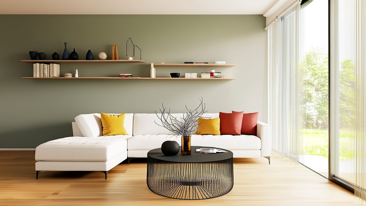
Color Planning for Rooms, Retail & Real Estate
Matching buying with place means selecting paint, finishes, textiles, and decor after reading the actual space: natural light, ceiling height, surface texture, use, and emotional goal. A color that looks perfect in a store swatch or digital screen can shift dramatically on a north-facing wall, in a bathroom with steam, or under 3000K retail lighting. This guide shows how to use Colorguides, brand formulas, and measured samples to connect purchase decisions to room conditions. It covers rooms, retail, hospitality, workplaces, returns, sampling, and a checklist that keeps buying aligned with place. By matching buying with place, buyers reduce failed samples, avoid expensive repainting, and choose colors that photograph, perform, and live well in the space they are meant for.
Why Place Should Lead the Color Purchase
Many buyers start with a favorite color, then search for a place that can carry it. That order works when the color is neutral, but it fails quickly with saturated greens, grays, blues, and warm whites. A place is not a blank canvas. It has windows, fixtures, floor materials, traffic patterns, and a schedule of use. Matching buying with place starts by asking what the space must do before asking what it must look like.
A 12 ft by 12 ft living room with two north-facing windows may need an LRV above 65 to stay readable after sunset. The same color in a south-facing room with 9 ft ceilings may feel too bright and cause glare. Colorguides help because they translate visual preference into measurable inputs: light reflectance value, chroma, hue family, undertone, sheen, and application surface. Those inputs let a buyer compare Benjamin Moore, Sherwin-Williams, Dulux, and Farrow & Ball formulas using the same criteria.
Undertone Is Not a Style Choice
Undertone is the hidden bias in a neutral or muted color. A gray paint can lean blue, green, purple, or beige depending on pigment load and light source. In a room with warm oak floors and bronze fixtures, a cool gray can look dirty. In a bathroom with white porcelain and chrome hardware, a yellow-leaning beige can look sickly. Buying by place means matching undertone to fixed materials already in the space, not forcing the space to match the swatch.
Professionals often use a 1 ft by 1 ft sample board placed on multiple walls and checked at 9 a.m., noon, and 7 p.m. A 3 ft by 3 ft board is better for large rooms, but even a small sample can reveal a Delta E shift greater than 3.0 under mixed lighting. That is visible enough to change a purchase decision before a gallon is opened.
Reading the Place Before Buying Paint
Place reading begins with light. North light tends to be cool and steady, so it can flatten warm whites and intensify gray-blue tones. South light is warmer and more variable, pushing yellow, orange, and cream toward saturation. East light is strongest in the morning and can make cool colors feel sharper. West light is warm in late afternoon and can turn gray-green walls muddy. A buyer should note window direction, glass type, overhang depth, and exterior view before selecting a Colorguide number.
Ceiling height changes how a color reads. An 8 ft ceiling can feel lower when a dark color is used on walls, especially if the ceiling is not painted the same color or a lighter shade. A 10 ft ceiling can support a deeper color such as Farrow & Ball Hague Blue or Sherwin-Williams SW 6981 Dark Navy, provided the floor and trim reflect enough light. In rooms with beams or ductwork, a dark ceiling may be chosen intentionally to hide structure and create intimacy.
Surface texture matters because paint films behave differently on plaster, drywall, brick, wood, metal, glass, and fabric. A flat sheen on rough plaster absorbs light and can make a color appear darker than the chip. A satin sheen on smooth drywall reflects more and can shift a pale color toward the lighter end of its range. In kitchens, a semi-gloss on cabinets may show more color depth than the same formula in eggshell on walls.
Fixed Materials Set the Color Contract
Fixed materials are non-negotiable until a renovation happens. They include stone countertops, tile, brick, flooring, roofing, window frames, and built-in fixtures. A color purchase should either harmonize with these elements or create a deliberate contrast. For example, a kitchen with Calacatta-style white quartz and gold veining can work with a warm white such as Benjamin Moore OC-17 White Dove or a soft gray-green such as Sherwin-Williams SW 6196 Sea Salt. A kitchen with black marble and steel hardware may need a crisper white such as Sherwin-Williams SW 7006 Extra White.
The color contract is a written decision that prevents drift. It lists the fixed material samples, the light conditions, the target mood, and the acceptable undertone family. If a buyer plans to buy a paint color from a Colorguide, the contract helps decide whether the color is meant to recede, advance, warm, cool, or highlight. Buying without a contract often leads to returns, extra coats, and mismatched trim.
Matching Buying With Place by Room Function
Rooms communicate purpose through color. A bedroom is for rest, a home office for focus, a kitchen for cleanliness and appetite, a bathroom for refreshment, and a living room for social ease. When buying by place, color is chosen to support the activity. A bedroom can use lower saturation and higher warmth, such as a 3000K lighting plan with a soft sage or dusty blue. A home office may use a clean blue-green or pale gray to reduce visual fatigue. A playroom can use high-chroma reds or yellows, but only if the place has enough light and containment.
Kitchen and Bathroom
Kitchens and bathrooms are wet, high-traffic places. Moisture, steam, grease, and frequent cleaning change the color purchase. A bathroom wall color should be tested with a humidity sample, not just a dry swatch. A kitchen cabinet color should be tested against a countertop sample under under-cabinet LED at 2700K and ceiling lights at 3500K. Benjamin Moore Advanced Waterborne Alkyd and Sherwin-Williams ProClassic are common cabinet finishes, but their sheen and leveling can alter perceived color. A satin cabinet color may look richer than a flat wall color even when the formula is close.
For small bathrooms, a high-LRV color can increase the feeling of cleanliness. Dulux Easycare and Valspar Interior lines often include durability claims, but the buyer should still check stain resistance and scrub rating. A color with LRV 55 to 65 can brighten a 5 ft by 7 ft bathroom without making it glare. A dark blue or green can work as a feature wall if it is balanced with white fixtures and a 60 to 80 watt-equivalent bulb, but it should not be used on all four walls without enough light.
Buying for Retail, Hospitality, and Workplace
In commercial places, color is part of the experience and operations. Retail buyers match buying with place by aligning wall color, flooring, lighting, signage, and product packaging. A boutique selling linen apparel may use warm beige walls at LRV 50 to 60, 3000K accent lights, and matte finishes to reduce glare. A tech accessory store may use cooler grays at LRV 35 to 45 with 4000K lighting to feel precise. Pantone references can help, but physical paint samples must be compared under the store lighting, not just on a digital screen.
Hospitality places need color to support rest, orientation, and brand recognition. Hotels often use deeper tones in corridors and lighter tones in guest rooms to manage perceived space and cleaning. A guest room may use a muted olive or blue-gray to reduce the sterility of a white bedsheet, while a lobby uses a warmer neutral to make the entrance inviting. Farrow & Ball and Benjamin Moore both offer historic or residential palettes, but commercial buyers should specify paint systems such as Benjamin Moore Aura Interior or Sherwin-Williams Emerald Interior Acrylic Latex for durability.
Workplaces require color that supports task, collaboration, and privacy. A focus room can use a low-chroma color such as Sherwin-Williams SW 7017 White Duck, which has an LRV around 73, to keep the space bright without harsh contrast. A creative meeting room may use a saturated accent wall with Pantone-inspired yellow or coral, but the wall should be measured at least 8 ft by 12 ft to avoid becoming visual noise. Colorguides for workplaces should include maintenance notes because chalkboard paint, magnetic paint, and glass surfaces change how color is perceived.
Using Colorguides to Reduce Returns and Rework
A Colorguide is most useful when it becomes a decision tool, not a shopping wish list. The buyer should compare three numbers from a brand, then translate them into place conditions. For example, if the place has north light, warm floors, and a goal of calm, a buyer might compare Benjamin Moore HC-172 Revere Pewter, Sherwin-Williams SW 6196 Sea Salt, and Dulux Easycare Warm Grey. Each formula should be checked for LRV, undertone, sheen, and recommended surface. The final purchase should be based on the sample that performs in the place, not the chip that looks best on the store wall.
Color returns and rework often come from four mistakes: buying without checking fixed materials, ignoring light direction, choosing the wrong sheen, and skipping a physical sample. A 1 ft by 1 ft sample can miss a large color shift. A 3 ft by 3 ft board or two coats on a portable panel is better. If a buyer must choose a paint color for an exterior, a 24 in by 24 in sample placed on the actual wall and observed over 24 hours is worth the time. The cost of one sample board is small compared with a 5 gallon bucket of paint and contractor labor.
Sample Testing That Matches the Place
Use a repeatable sample method. Paint two coats on a primed panel, leave it in the room for 24 to 48 hours, and view it at three times of day. Check it against the floor, countertop, trim, and largest fabric. Take photos with a color checker card if available, but do not rely only on phone cameras because white balance can shift. If the sample looks acceptable only in one lighting condition, the place has not been matched yet.
- Paint the sample twice in the room where it will be used, not in a hallway or garage.
- Place one board on the darkest wall and one near the largest window.
- Review the sample at morning, noon, and evening under both natural and artificial light.
- Compare the sample with a fixed material such as tile, flooring, stone, or metal.
- Reject the color if it only works under one lighting condition.
A Practical Purchase Checklist for Place-Matched Color
Before opening a Colorguide, write the place profile. It should include the room or business area, dimensions, window direction, ceiling height, fixed materials, lighting temperature, traffic level, and desired mood. This profile turns buying into a place-based task. The checklist below helps buyers move from inspiration to a confident purchase.
- Measure the space: note wall length, ceiling height, window size, and whether the room is under 100 sq ft, 100 to 250 sq ft, or over 250 sq ft.
- Record light: list north, south, east, or west exposure, artificial lighting temperature, and any glare problem.
- Identify fixed materials: collect physical samples of flooring, stone, tile, metal, trim, and major furniture.
- Define function: choose whether the place needs calm, focus, appetite, cleanliness, play, luxury, or durability.
- Select Colorguide candidates: pick three colors that differ in LRV and undertone, not just three shades of the same family.
- Test on site: use a 1 ft by 1 ft minimum sample, preferably 3 ft by 3 ft, and check at morning, midday, and evening.
- Confirm sheen and system: match paint finish to traffic, moisture, and surface type.
- Approve a final contract: document the chosen color, brand, sheen, primer, number of coats, and lighting assumptions.
When the checklist is complete, buying becomes simpler. The buyer can say that the Colorguide number matches the place because it meets the light, material, function, and durability conditions. That statement is more reliable than a preference statement. It also protects the purchase if someone questions the choice later.
| Place Type | Color Goal | Sample Size | Light Check | Brand Examples |
|---|---|---|---|---|
| North-facing bedroom | Calm, warm, readable | 3 ft by 3 ft board | 9 a.m. and 7 p.m. | Benjamin Moore White Dove, Sherwin-Williams Accessible Beige |
| South-facing living room | Soft, low-glare, social | 2 ft by 4 ft panel | noon and sunset | Farrow & Ball Cornforth White, Dulux Easycare |
| Kitchen cabinets | Clean, durable, coordinated | Cabinet door sample | under-cabinet and ceiling | Benjamin Moore Aura, Sherwin-Williams Emerald |
| Retail fitting rooms | Flattering, bright, brand-safe | 1 ft by 1 ft plus mirror check | 3000K and 4000K | Pantone reference, Valspar, Behr |
| Office focus room | Low fatigue, clear boundaries | Wall section 8 ft by 8 ft | task and ambient | Sherwin-Williams White Duck, Benjamin Moore Revere Pewter |
The table is not a rulebook. It is a reminder that place changes the buying standard. A retail fitting room may need a color that works on skin, a focus room may need a color that does not compete with screens, and a kitchen cabinet may need a color that can survive hand oils. Matching buying with place means the product purchase is tested against those realities.
From Color Chip to Confident Buy
The final step is to translate the place reading into a purchase order. A confident buy includes the brand, product line, color number, sheen, primer, finish schedule, and sample approval. It also includes a decision point for unexpected materials. If a buyer discovers a floor with a stronger undertone than expected, the Colorguide candidate may need to move from a cool gray to a warm neutral. If a room is smaller than the photo suggests, the same color may need a higher LRV. Place-based buying accepts that the space, not the chip, has authority.
For homeowners, this method reduces the emotional cost of repainting. For contractors, it reduces callbacks. For retail and hospitality teams, it protects brand consistency. For designers, it creates a defensible color narrative. Colorguides are valuable because they organize choices, but the buy only works when it is matched with place. The place tells you what the color must survive: light, touch, moisture, reflection, and daily use. When buying follows that instruction, color stops being a guess and becomes a measured part of the space.
More Articles
 Triadic Color Scheme Applications - The Decor Mag
 How to Choose Bathroom Paint Colors - The Decor Mag
 Studio Color Palettes That Expand Small Rooms
 Best Olive Green Paint Colors (2026) | The Decor Mag
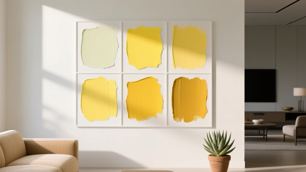 Best Citron Paint Colors - The Decor Mag
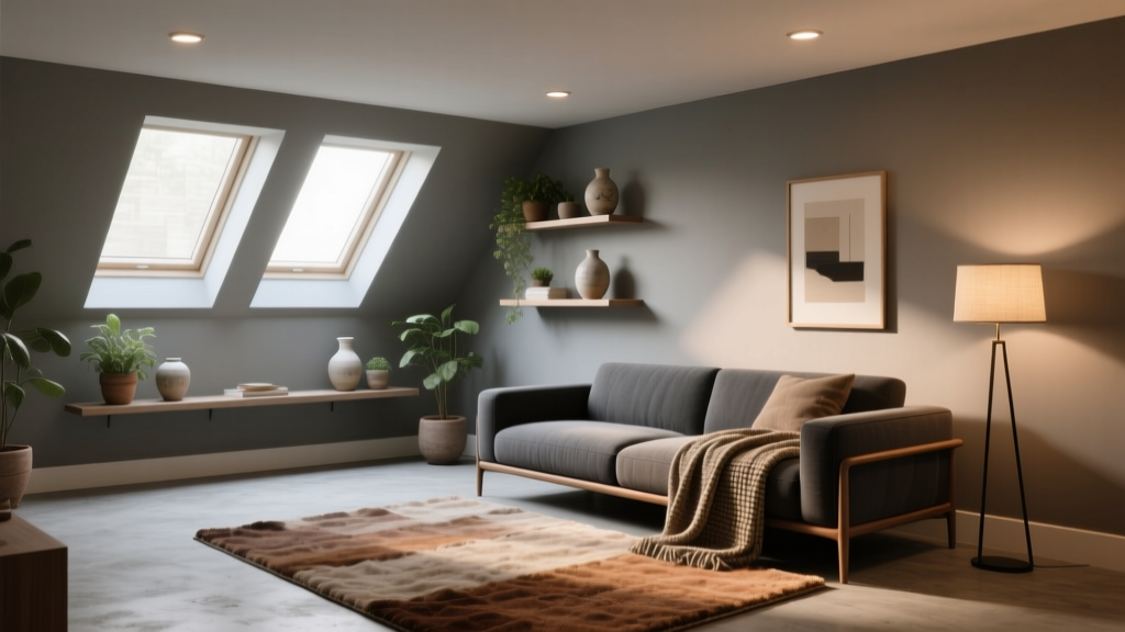 How to Choose Colors for a Basement - The Decor Mag
 How to Create a Serene Color Palette - The Decor Mag
 How to Create a Timeless Color Palette - The Decor Mag
 Best White Paint Colors Compared - The Decor Mag
 Best Matches for 2026: Safety, Performance & Buying Tips