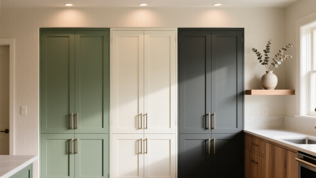
Kitchen Cabinet Color Trends - The Decor Mag
Cabinet color is one of the biggest visual decisions you’ll make in a kitchen renovation—often bigger than countertops or flooring—because it covers the largest surface area at eye level. The right cabinet color can brighten a dim layout, make a small kitchen feel larger, and tie together finishes like hardware, backsplash tile, and lighting.
Today’s kitchen design trends are less about one “it” shade and more about purposeful palettes: warm neutrals that feel inviting, nature-inspired greens and blues that add depth, and high-contrast combinations that create a custom, designer look. Homeowners are also prioritizing timeless functionality—durable finishes, easy maintenance, and colors that won’t feel dated two years after the renovation.
This guide breaks down current kitchen cabinet color trends, how to choose a palette for your space, what materials and finishes hold up best, budget ranges, and the mistakes that cause expensive do-overs.
What’s Driving Kitchen Cabinet Color Trends Right Now
Several shifts in how people use their homes are influencing cabinet color choices:
- Warmer interiors: Beige, greige, taupe, and creamy off-whites are replacing icy grays.
- Natural, grounded palettes: Earth tones and botanical hues pair well with wood, stone, and handmade tile.
- More intentional contrast: Two-tone cabinets, statement islands, and mixed materials add dimension without requiring a full gut renovation.
- Practical living: Homeowners want finishes that hide fingerprints, resist scratches, and are easy to clean.
From a resale standpoint, neutral cabinet colors still appeal broadly, but tasteful color is no longer considered risky—especially when used on lower cabinets or islands.
Top Kitchen Cabinet Color Trends (And How to Use Them)
1) Warm Whites and Creams (Not Stark White)
White cabinets remain popular, but the trend has shifted from bright, cool whites to softer, warmer tones. These shades feel inviting and pair seamlessly with brass, bronze, black, or nickel hardware.
Best for: Small kitchens, low-light kitchens, traditional-to-modern transitional styles.
Design pairings:
- Countertops: Warm quartz with subtle veining, butcher block, or honed granite.
- Backsplash: Off-white zellige tile (handmade look), warm subway tile, or limestone-look porcelain.
- Hardware: Unlacquered brass for a lived-in patina, or satin nickel for classic longevity.
Maintenance tip: Choose a satin or matte cabinet finish to minimize glare and reduce the appearance of smudges. High-gloss shows every fingerprint and can highlight wall imperfections.
2) Greige and Taupe Neutrals
Greige (a blend of gray and beige) and taupe are practical “bridge” colors—neutral but not flat. They work especially well in open-concept homes where the kitchen must flow into living and dining areas.
Best for: Open layouts, busy family kitchens, homes with warm wood floors.
Pro tip for undertones: Test paint samples next to your countertop and flooring at three times of day. A greige that looks perfect at noon can read green or pink under warm evening lighting.
Budget-friendly upgrade idea: If a full cabinet replacement isn’t in the plan, a professional spray finish on existing doors in a modern taupe can make older kitchens feel brand new.
3) Earthy Greens: Olive, Sage, and Deep Forest
Green cabinets are leading modern kitchen color trends because they feel calm, organic, and sophisticated. Softer sages are great for airy spaces; deeper greens add drama without the harshness of pure black.
Best for: Homes with natural materials (wood beams, stone, brick), kitchens with good natural light, and homeowners who want a “designer” look.
Where to use green:
- All cabinets: Best in larger kitchens or when balanced by light countertops and walls.
- Lower cabinets only: Keeps the kitchen grounded while uppers stay light.
- Island feature: A lower-commitment way to try a trend.
Material recommendation: For painted green cabinets, maple doors typically take paint smoothly with minimal grain telegraphing. Oak can work beautifully too, but it will show texture unless grain-filled.
4) Moody Blues: Navy, Ink, and Blue-Gray
Blue cabinets remain a staple in contemporary and classic kitchens, especially deeper navies and inky tones. They pair well with a wide range of metals and can look elevated even in budget-friendly cabinet lines.
Best for: Transitional kitchens, coastal-inspired homes (without leaning theme-y), and larger kitchens with layered lighting.
Lighting note: Dark blues need a strong lighting plan. Aim for:
- Ambient lighting: Recessed lights spaced about 4–6 feet apart (varies by ceiling height and fixture output).
- Task lighting: Under-cabinet LED strips at 2700K–3000K for warm, accurate color.
- Accent lighting: Pendants over the island, ideally 30–36 inches above the countertop.
5) Natural Wood and “Wood-Forward” Kitchens
Wood cabinets are back in a big way—especially white oak, walnut, and wood tones that feel natural rather than orange. Many homeowners are also mixing wood with painted cabinets for warmth and contrast.
Best for: Modern organic design, Scandinavian-inspired kitchens, and homeowners wanting timeless appeal.
Material comparisons:
- White oak: Durable, light-to-medium tone, works with black or brass hardware; great for a modern organic look.
- Walnut: Rich and luxurious; pairs well with creamy whites and stone with warm veining.
- Maple: Smooth grain; excellent for painted finishes; can also be stained evenly.
Maintenance tip: For wood cabinets, pick a durable topcoat (conversion varnish or high-quality catalyzed finish). Wipe spills quickly and avoid harsh degreasers that can dull the sheen over time.
6) Charcoal, Soft Black, and High-Contrast Kitchens
Black cabinets are no longer niche—they’re a modern classic when executed thoughtfully. Softer “off-black” and charcoal tones feel more forgiving than pure black, especially in everyday family kitchens.
Best for: Contemporary kitchens, large spaces, and homeowners who prefer bold design.
How to keep it from feeling heavy:
- Use a light countertop and backsplash to reflect light.
- Include glass-front uppers or open shelving in small doses.
- Choose a matte finish to reduce smudges and glare.
7) Two-Tone Cabinets and Statement Islands
Two-tone kitchen cabinets remain one of the most practical and popular renovation strategies. They add depth and allow you to balance trend-forward color with timeless neutrals.
Reliable two-tone formulas:
- Light uppers + darker lowers: Makes ceilings feel taller and keeps the room airy.
- Neutral perimeter + colorful island: A safe way to add personality.
- Wood lowers + painted uppers: Warm, modern, and highly livable.
Layout tip: In an open-concept kitchen, repeat the island color in small accents (bar stools, art, or a pantry door) to make the palette feel intentional.
Choosing the Right Cabinet Color for Your Kitchen
Use the “Fixed Finishes First” Rule
Before choosing a cabinet color, lock in what’s hardest or most expensive to change:
- Flooring
- Countertops
- Backsplash tile (if it’s a feature)
- Appliances (especially if not stainless)
Then choose cabinet color to complement those finishes. This prevents costly mismatch—like selecting a cool cabinet color with warm floors.
Practical Color Selection Tips (That Prevent Regret)
- Sample size matters: Paint a 2 ft x 2 ft sample board (or buy peel-and-stick cabinet samples) and view it vertically, near counters and backsplash.
- Account for lighting temperature: Warm LEDs (2700K) make colors read warmer; cool LEDs (4000K) can make creams look dingy.
- Consider maintenance: Mid-tone colors (taupe, sage, blue-gray) often hide crumbs, scuffs, and fingerprints better than pure white or jet black.
- Balance with the right sheen: Satin is the sweet spot for most kitchens—durable, wipeable, and less reflective than semi-gloss.
Materials and Finishes: What Holds Up Best
Painted vs. Stained Cabinets
- Painted cabinets: Ideal for trend colors (green, navy, soft black). Expect touch-ups over time, especially around pulls and trash pull-outs.
- Stained or natural wood cabinets: Often more forgiving for small nicks because the color goes through the material look; great for long-term timeless design.
Door Styles That Complement Today’s Colors
- Shaker: Works with every trend; a safe, timeless choice.
- Slab/flat-panel: Best for modern kitchens, especially with wood or matte painted finishes.
- Inset doors: High-end and tailored; higher cost and more precise installation.
Hardware and Fixtures: Small Choices, Big Impact
Hardware acts like jewelry for cabinetry and can shift the whole vibe of a color choice:
- Brass: Warms up blues, greens, and creams.
- Matte black: Sharp contrast with light cabinets; modern with wood.
- Polished nickel: Classic, bright, and durable—great for timeless renovations.
Placement tip: Standard pulls are often 3–5 inches from the bottom corner of upper doors and 2–3 inches from the top of lower doors (adjust based on door style). For drawers, center the pull horizontally and vertically on the drawer front.
Costs and Budget Considerations
Cabinet color decisions can affect your budget depending on whether you’re painting, refacing, or replacing cabinets.
Typical Cost Ranges (U.S.)
- DIY painting: $200–$800 for supplies (primer, paint, sandpaper, rollers/sprayer rental). Best for patient DIYers with time for prep.
- Professional cabinet painting (sprayed finish): $3,000–$8,000 for an average kitchen, depending on door count, repairs, and local labor rates.
- Refacing (new doors + paint/veneer): $6,000–$15,000. Good when cabinet boxes are solid but doors are dated.
- Stock/semi-custom cabinet replacement: $8,000–$25,000 (cabinetry only), depending on size, brand, and features.
- Custom cabinetry: $25,000–$60,000+ for larger kitchens or premium builds.
Where to Spend for Long-Term Value
- Durable finish: A quality sprayed coating and proper curing time pays off in fewer chips and touch-ups.
- Organization upgrades: Pull-out trash, tray dividers, and deep drawer storage often improve daily function more than a pricey color change.
- Lighting: Under-cabinet lighting makes cabinet color look richer and improves task performance.
Common Mistakes to Avoid
- Choosing cabinet color in isolation: Always evaluate alongside countertops, flooring, and wall color.
- Ignoring undertones: Warm floors with cool cabinets (or vice versa) creates a “slightly off” look that’s hard to fix later.
- Going too dark in a low-light kitchen: If you love deep colors, use them on the island or lowers and keep uppers light.
- Picking the wrong sheen: High-gloss highlights fingerprints and surface flaws. Matte hides smudges but can be harder to scrub if the product isn’t high quality. Satin is often the best compromise.
- Skipping proper prep: For painted cabinets, poor sanding/degreasing leads to peeling—especially near the stove and sink.
- Over-trending without an anchor: If you choose a bold cabinet color, keep at least two other major elements classic (countertops, backsplash, flooring) for balance.
Maintenance Advice for Long-Lasting Cabinet Color
- Clean gently: Use a microfiber cloth with mild soap and water. Avoid abrasive pads and harsh degreasers that can dull or strip finishes.
- Control moisture: Run the range hood while cooking and wipe condensation near dishwashers and sinks to prevent finish wear.
- Add bumpers: Soft-close hinges help, but adhesive door bumpers reduce impact and paint chipping.
- Keep touch-up paint: Store a labeled jar of your cabinet color for quick fixes around pulls and edges.
FAQ: Kitchen Cabinet Color Trends
What cabinet colors are most timeless for resale?
Warm whites, soft creams, greige, and natural wood tones tend to have the broadest appeal. If you want color, consider a statement island in navy or green while keeping perimeter cabinets neutral.
Are gray cabinets out of style?
Cool, blue-based grays are less popular than they were, but warmer grays and greige still work well—especially when paired with warm metals and natural materials like wood and stone.
Should upper and lower cabinets be the same color?
They don’t have to be. Matching cabinets feels calm and cohesive; two-tone cabinets add depth and can make a kitchen feel larger when uppers are lighter. A common approach is light uppers and darker lowers for a grounded look.
What’s the best cabinet finish for hiding fingerprints?
Matte and satin finishes hide fingerprints better than semi-gloss. For families, satin is often the most practical because it’s durable and easier to clean than many true matte products.
How do I choose cabinet color if my kitchen is small?
Use lighter colors (warm white, cream, light greige) on perimeter cabinets to reflect light, and add contrast through an island, hardware, or a deeper lower cabinet color. Also consider glass-front doors in a small section to reduce visual weight.
Is painting cabinets worth it compared to replacing them?
If your cabinet boxes are sturdy and the layout works, painting or refacing can deliver a major visual upgrade at a fraction of replacement cost. If you need better storage, improved workflow, or you’re changing the kitchen layout, replacement may be the better long-term investment.
Next Steps: Turn Trends Into a Kitchen You’ll Love
Start by identifying your kitchen’s fixed finishes (flooring and countertops), then narrow your cabinet color options to three candidates. Test large samples in your lighting, choose a durable satin finish, and plan your hardware and lighting so the color looks intentional—not accidental. If you’re using a bold shade, anchor it with classic materials and smart kitchen organization features that improve daily life.
For more kitchen renovation ideas, cabinet styles, and space-planning tips, explore the latest guides and inspiration at thedecormag.com.
More Articles
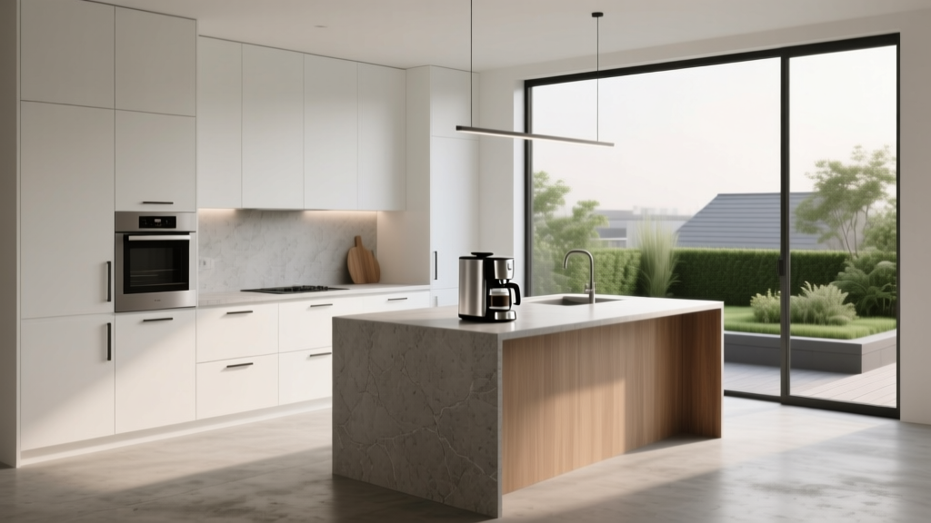 Minimalist Kitchen Design Essentials - The Decor Mag
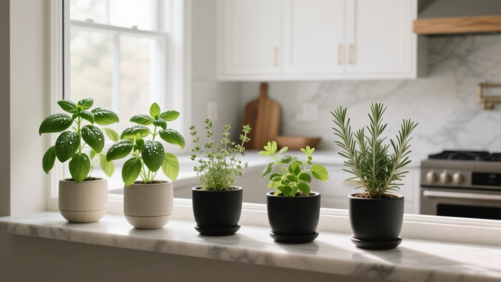 Best Kitchen Herb Garden Window Ideas - The Decor Mag
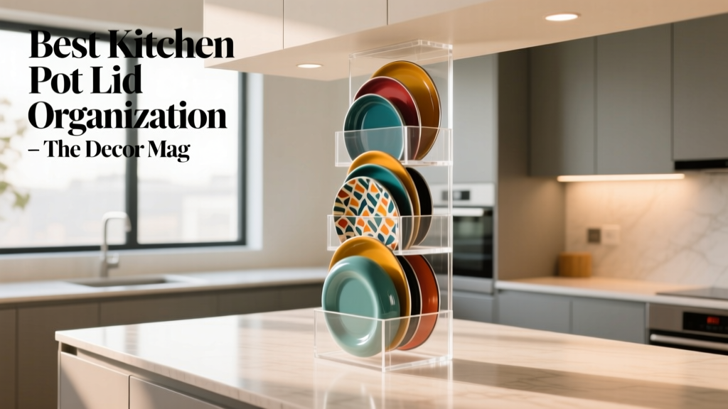 Best Kitchen Pot Lid Organization - The Decor Mag
 Kitchen Statement Ceiling Design Ideas - The Decor Mag
 How to Choose Kitchen Countertop Thickness - The Decor Mag
 Kitchen Book-Matched Stone Backsplash - The Decor Mag
 Minimalist Alternatives to Essential Kitchen Tools: Smart Substitutions That Reduce Clutter Without Compromising Performance
 Best Kitchen Cutting Board Display | The Decor Mag
 Science for Beginners: Clear, Kitchen-Tested Principles You Can Use Today
 Best Kitchen Rug Options for Comfort - The Decor Mag