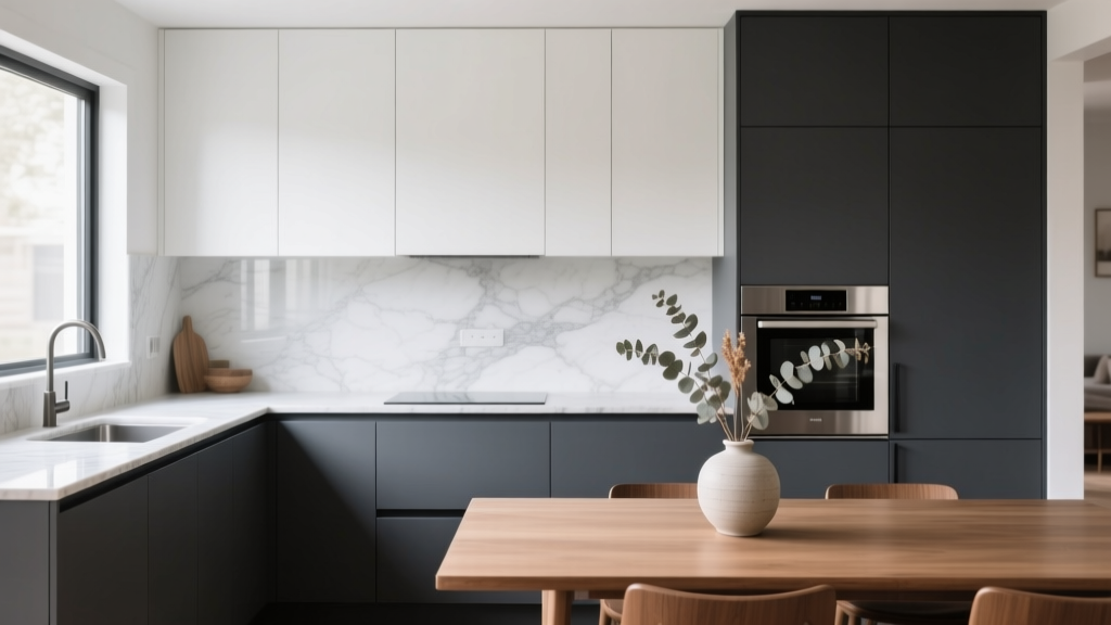
Kitchen Two-Tone Cabinet Ideas - The Decor Mag
Two-tone kitchen cabinets have moved from “designer trick” to mainstream renovation staple—and for good reason. They’re one of the most reliable ways to add depth, personality, and a custom look without committing to a full kitchen overhaul. Whether you’re working with a compact galley or an open-concept great room, mixing cabinet colors (or finishes) can visually balance the space and make everyday features—like an island or a coffee station—feel intentional.
This approach also solves a common homeowner dilemma: you want a light, airy kitchen, but you don’t want it to feel bland. Or you love dark, dramatic cabinetry, but worry it will shrink the room. Two-tone cabinetry gives you the best of both worlds—brightness where you need it, contrast where it elevates the design—while supporting timeless functionality principles like clear work zones, durable surfaces, and easy maintenance.
Below are practical two-tone cabinet combinations, layout strategies, material recommendations, and budget guidance to help you plan a kitchen renovation that looks current, works hard, and ages well.
Why Two-Tone Cabinets Work (Design + Function)
- Improves visual proportion: Light uppers can lift the eye and reduce “heavy” walls of cabinetry; darker bases can ground the room.
- Creates focal points: A different island color or a standout pantry wall makes a kitchen feel curated.
- Supports organization: Color-blocking can visually separate zones (prep, cooking, serving), which helps day-to-day workflow.
- Flexibility for updates: If you repaint later, changing one tone is less disruptive than redoing everything.
Two-Tone Cabinet Layouts That Look Intentional
1) Light Upper Cabinets + Dark Lower Cabinets
This is the most classic two-tone kitchen cabinet layout. It keeps the room bright while hiding scuffs and wear where hands, shoes, and spills do the most damage.
- Best for: Small to mid-size kitchens, low natural light, open shelving mixed with uppers.
- Try: White or warm off-white uppers + charcoal, navy, deep green, or walnut-stained lowers.
- Practical tip: If your ceilings are under 8 feet, choose uppers in a lighter tone and run them to the ceiling to avoid a “chopped” look.
2) Dark Upper Cabinets (Used Carefully) + Light Lowers
Dark uppers can feel sophisticated and modern—especially in kitchens with tall ceilings and strong lighting. Done incorrectly, they can feel top-heavy.
- Best for: 9-foot+ ceilings, large kitchens, walls with minimal upper cabinetry.
- Make it work: Use dark uppers on one wall only (like a pantry run) and keep other walls light.
- Lighting rule: Plan layered lighting—recessed + under-cabinet LED strips (3000K for warm-neutral) + pendants.
3) Statement Island in a Contrasting Color
If you want two-tone cabinets without the risk of mismatched walls, make the island the “second tone.” This is a top current trend because it’s impactful yet controlled.
- Best for: Open-concept homes where the island is seen from living/dining areas.
- Try: Perimeter cabinets in warm white + island in forest green, slate blue, or stained oak.
- Measurement checklist:
- Allow 42 inches of clearance around the island for standard traffic.
- Allow 48 inches if two cooks will pass behind each other or if appliances open into the aisle.
- For seating, plan 24 inches width per seat and 12–15 inches overhang (check countertop material support requirements).
4) Tall Pantry/Appliance Wall as the Second Tone
A dedicated tall cabinet wall (pantry + ovens + fridge surround) looks sharp in a contrasting finish and helps the kitchen feel organized.
- Best for: Kitchens needing more storage, homeowners who want a “built-in” look.
- Design approach: Keep base and uppers consistent on the main run, then switch color/finish for tall units.
- Pro tip: If you’re using a darker tone here, add interior cabinet lighting or a lighter backsplash nearby to prevent a cave-like effect.
Trending + Timeless Two-Tone Color Combinations
Warm White + Natural Wood
Warm whites (not stark bright white) pair beautifully with oak or walnut tones. This combination aligns with current trends favoring warmer palettes and natural textures.
- Works with: Brass, champagne bronze, or black hardware.
- Style range: Scandinavian, modern farmhouse, transitional.
- Maintenance: Wood-grain laminates and wood-look thermofoil can mimic oak while resisting moisture better than raw wood.
Greige + Deep Green
Greige reads soft and timeless; deep green adds drama without feeling too trendy when kept to lower cabinets or an island.
- Backsplash pairing: Off-white zellige-look tile or a subtle veined quartz for movement.
- Paint tip: Use a cabinet-grade enamel with a hard cure (waterborne alkyd or acrylic-alkyd hybrid) for better scratch resistance.
Navy + White (Crisp but Classic)
Navy continues to hold its place in kitchen design because it behaves almost like a neutral. Pair it with warm metals to avoid a cold look.
- Countertop pairing: White quartz with light veining; honed or matte finishes reduce glare and hide fingerprints.
- Hardware: Satin brass or polished nickel for a tailored finish.
Charcoal + Light Oak (Modern Organic)
This is a strong choice for homeowners who like modern lines but want warmth. Use charcoal on the island or lowers, and light oak for uppers or tall cabinets.
- Design detail: Flat-panel or slim Shaker doors keep it current.
- Flooring: Mid-tone wood floors prevent the space from looking too contrast-heavy.
Materials and Finishes: What Performs Best in Real Kitchens
Painted Wood (Maple, Poplar) vs. MDF
- Painted hardwood: Durable and refinishable; may show grain telegraphing over time. Great for longevity.
- MDF doors: Very smooth for paint; stable in normal indoor humidity. Avoid for areas prone to standing water (e.g., sink base) unless edges are well sealed.
Thermofoil vs. Laminate vs. Veneer
- Thermofoil: Budget-friendly, easy to wipe clean; can peel near heat sources if poor quality or placed too close to ovens. Use heat shields.
- Laminate (HPL): Extremely durable and scratch-resistant; excellent for busy family kitchens and modern styles.
- Wood veneer: Real wood look with less cost than solid wood; choose quality edging and protective topcoats to prevent chipping.
Sheen Levels for Cabinet Paint
- Satin: Most common sweet spot—wipeable without highlighting every bump.
- Semigloss: More reflective and durable, but shows surface imperfections more easily.
- Matte: Beautiful and current, but can show grease/fingerprints; best with premium cleanable formulas.
Countertops, Backsplashes, and Hardware That Tie Two Tones Together
Countertop Recommendations
- Quartz: Low maintenance and consistent. Budget range: $60–$120 per sq. ft. installed depending on thickness and brand.
- Granite: Natural variation; needs periodic sealing. Budget range: $50–$120 per sq. ft. installed.
- Butcher block: Warm and affordable; requires oiling and care around sinks. Budget range: $40–$100 per sq. ft. installed.
Design tip: If your cabinet tones are high-contrast (white + charcoal), choose a countertop that has a bridging element (soft veining, warm undertone, or subtle movement) to avoid a stark “checkerboard” effect.
Backsplash Ideas
- Classic subway tile (3x6 or 3x12): Timeless and budget-friendly. Installed cost often $15–$40 per sq. ft.
- Full-height slab backsplash: Clean and modern, fewer grout lines. More expensive, often $70–$150+ per sq. ft. depending on material.
- Zellige-look ceramic: Adds texture and trend appeal without high maintenance; choose a coordinating grout color for easier cleaning.
Hardware and Faucet Finishes
- Brushed/satin brass: Warms up cool palettes (navy, charcoal, gray).
- Matte black: Crisp contrast; choose quality finishes to avoid chipping.
- Polished nickel: Classic, reflective, works in traditional and transitional kitchens.
Placement guideline: Standard pulls are often 3–5 inches from the bottom corner of upper doors and 2–3 inches from the top corner of base doors. Keep placement consistent across both cabinet colors for a cohesive look.
Budget and Cost Ranges for Two-Tone Cabinet Projects
Option 1: Paint Existing Cabinets (Most Budget-Friendly)
- DIY cost: Often $200–$800 for quality primer, cabinet enamel, sandpaper, fillers, and tools (more if you buy a sprayer).
- Professional painting: Commonly $3,000–$10,000 depending on kitchen size, door count, repairs, and spray vs. brush/roll methods.
Best for: Cabinets in good structural shape. Two-tone can be done by painting uppers one color and lowers another, or making the island a different color.
Option 2: Reface (New Doors + Paint/Wrap Boxes)
- Typical range: $6,000–$18,000.
- Best for: Homeowners who want a major look change while keeping the existing layout.
Option 3: Replace Cabinets (Full Renovation)
- Stock/semi-custom cabinets: Often $8,000–$25,000+ for cabinets alone.
- Custom cabinetry: Frequently $25,000–$60,000+ depending on size, materials, and interior upgrades.
Budget tip: Spend on the features you touch daily: soft-close hinges, full-extension drawers, and durable finishes for base cabinets. Use a simpler finish on uppers or open shelving to control costs.
Two-Tone Cabinet Design Tips for Flow and Proportion
- Limit the palette: Two cabinet tones + one countertop + one metal finish is usually enough. Add color through decor and textiles.
- Repeat each tone at least twice: Example: island color also appears in bar stools, runner, or small appliances so it looks intentional.
- Mind undertones: Pair warm whites with warm woods; cool grays with crisp whites; avoid mixing clashing undertones (yellowish cream + icy blue-gray) unless you’re confident with color correction.
- Use consistent door styles: Keep the same door profile across both tones for a cleaner, more cohesive kitchen design.
- Plan for lighting: Two-tone looks best with even illumination. Under-cabinet lighting reduces shadows and makes darker lowers feel richer rather than heavy.
Maintenance Advice: Keeping Two-Tone Cabinets Looking New
- Daily wipe-down: Use a microfiber cloth and mild dish soap diluted in warm water. Avoid abrasive pads.
- Degrease monthly: Around the range and near pulls/knobs. Rinse and dry to prevent residue buildup.
- Protect near heat: Install heat shields next to ovens if using thermofoil or laminate doors close to high heat.
- Touch-up kit: Keep labeled paint or filler sticks for each cabinet color; store in a cool, dry place for quick repairs.
- Hinge checks: Tighten hinges and adjust doors every 6–12 months—especially on heavy pantry doors.
Common Mistakes to Avoid
- Choosing two bold colors with no “bridge”: If both tones are saturated (e.g., navy + emerald), the space can feel busy. Balance with a calm countertop and backsplash.
- Ignoring the fixed finishes: Floors, countertops, and backsplash don’t change as easily as paint. Choose cabinet tones that harmonize with those elements.
- Overusing dark colors in small kitchens: Too many dark surfaces can shrink the room. If you love dark tones, use them on lowers only or on a single feature area.
- Mismatch in sheen: Two colors are fine; two different gloss levels often look accidental. Keep sheen consistent across both tones.
- Skipping sample testing: Cabinet colors can shift dramatically under warm LEDs vs. daylight. Test large samples and view them morning, afternoon, and night.
FAQ: Kitchen Two-Tone Cabinets
Are two-tone kitchen cabinets still in style?
Yes. Two-tone cabinetry remains a strong kitchen design trend because it adds dimension and personalization. The most enduring versions use timeless neutrals (warm white, greige, navy) paired with natural wood or a grounded dark tone.
Should the upper cabinets be lighter or darker?
Lighter uppers are the safer, more universally flattering choice—especially for smaller kitchens or lower ceilings. Dark uppers can work in tall, well-lit spaces or when limited to one wall.
How do I choose a second cabinet color that won’t feel trendy?
Look for classic, nature-based hues (deep green, navy, charcoal) or wood tones (oak, walnut). Keep the door style simple and pair with a timeless countertop and backsplash to future-proof the look.
Can I do two-tone cabinets in a small kitchen?
Absolutely. Use light uppers to keep the room open, and choose a mid-tone or dark color on the lower cabinets for practicality. Consider glass-front uppers or open shelving in small doses to reduce visual bulk.
What’s the most affordable way to get the two-tone look?
Painting is typically the most budget-friendly option, especially if your cabinet boxes are in good condition. A contrasting island or lower cabinets can deliver the effect without repainting every surface.
Do two-tone cabinets make a kitchen look cluttered?
They can if too many finishes compete. Limit the palette, repeat each tone in at least one other element, and keep countertops relatively clear with smart kitchen organization features like drawer dividers, pull-out trash, and appliance garages.
Next Steps: Plan Your Two-Tone Kitchen with Confidence
Start by choosing your layout strategy—light uppers/dark lowers, a contrasting island, or a statement pantry wall—then build a tight palette around your existing floors and your preferred countertop. Order large color samples, test them under your actual kitchen lighting, and decide where you need durability most (usually lower cabinets, sink base, and trash pull-out areas). Finally, lock in hardware and lighting early so every finish feels connected.
For more renovation-ready kitchen design ideas, cabinet trends, storage upgrades, and space-planning tips, explore the latest guides and inspiration on thedecormag.com.
More Articles
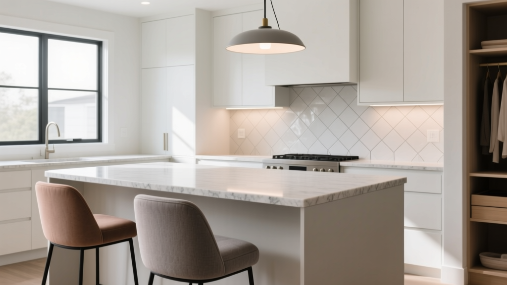 Kitchen Island Seating Overhang: How Much? (2026)
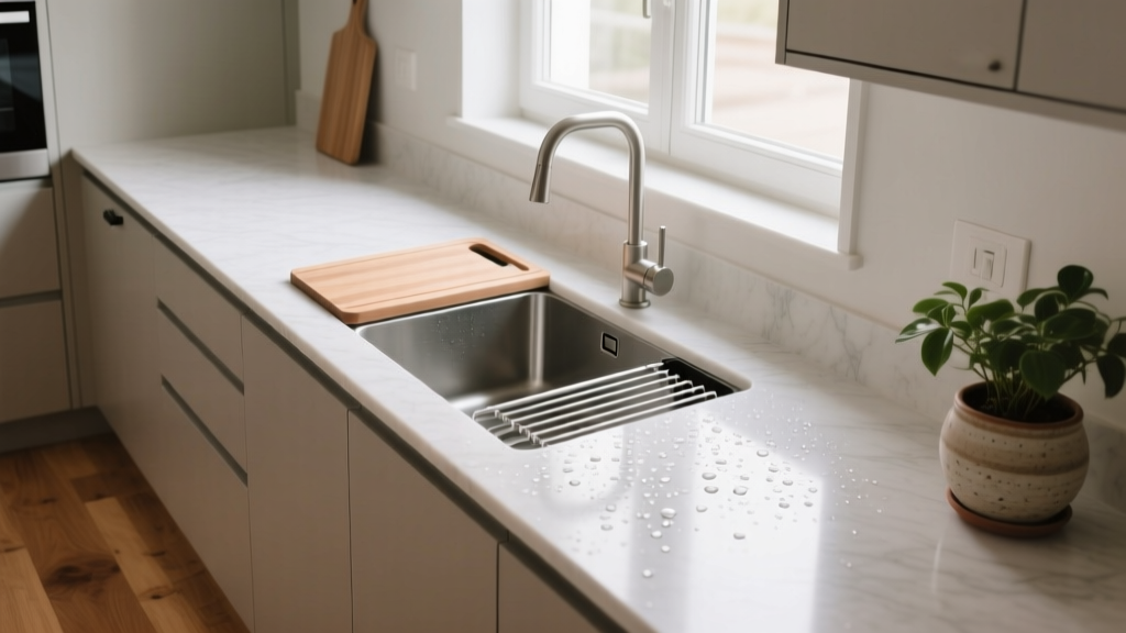 Kitchen Integrated Drainboard Sink Guide - The Decor Mag
 Kitchen That Inspires Cooking: Design Ideas (2026)
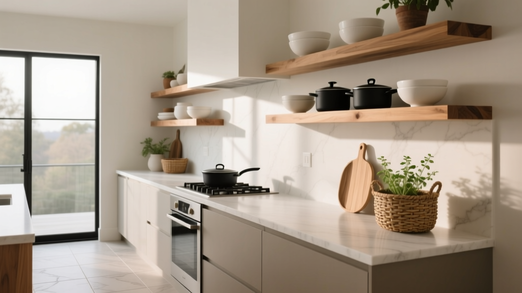 Open Shelving in Kitchens: Ideas & Tips (2026)
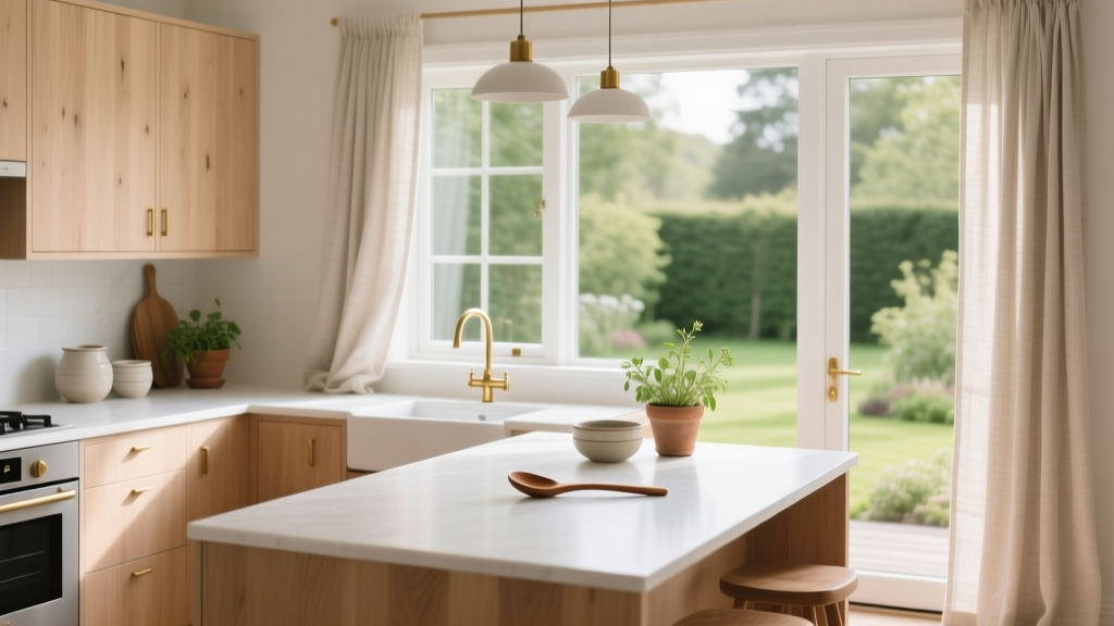 Scandinavian Kitchen Design Guide - The Decor Mag
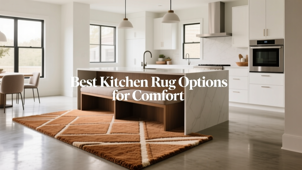 Best Kitchen Rug Options for Comfort - The Decor Mag
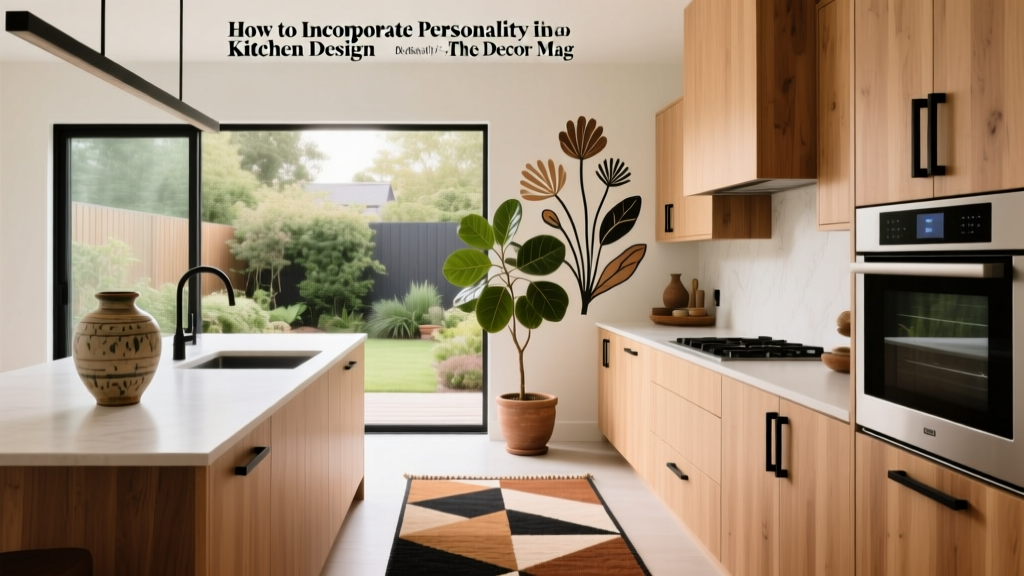 Personality in Kitchen Design: Ideas for 2026
 Heirloom Kitchen Design: Timeless Ideas for 2026
 Best Kitchen Spice Drawer Inserts - The Decor Mag
 Best Kitchen Herb Garden Window Ideas - The Decor Mag