Kitchen Warm Neutral Cabinet Colors - The Decor Mag
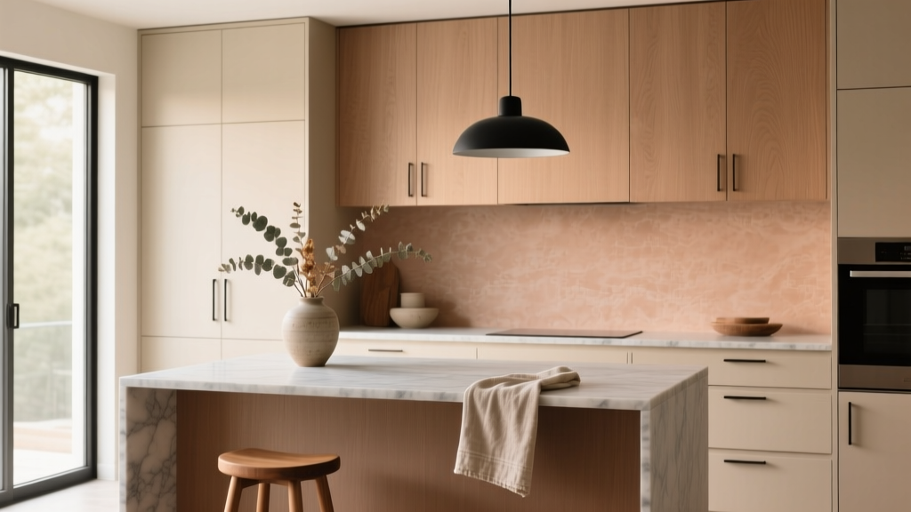
Warm neutral cabinet colors are having a moment in kitchen design—and they’re also one of the safest long-term choices you can make. While bright whites and cool grays dominated for years, homeowners renovating today are leaning toward warmer, softer palettes that feel welcoming, hide everyday wear better, and pair beautifully with natural materials like wood, stone, and aged metals.
Choosing the right cabinet color matters because cabinets are the biggest visual “surface” in most kitchens. They set the tone for everything else: countertops, backsplash, flooring, hardware, lighting, even how organized and calm the space feels. Warm neutrals create a flexible backdrop that supports timeless functionality while still aligning with current trends like organic modern, transitional, and updated traditional kitchens.
If you’re planning a kitchen renovation or a cabinet refresh, this guide breaks down the most flattering warm neutral cabinet colors, how to match them to your finishes, what they cost, and the practical details that keep your kitchen looking great for years.
What Counts as a “Warm Neutral” Cabinet Color?
Warm neutrals sit on the beige-to-brown spectrum, often with subtle undertones that make them feel cozy rather than stark. They include:
- Warm whites (creamy, ivory, antique white)
- Greige (gray-beige blends leaning warm)
- Beige and sand (light tan, oatmeal)
- Taupe (beige + brown/gray, often sophisticated and earthy)
- Mushroom (soft taupe-gray with warmth)
- Warm wood tones (white oak, walnut, rift sawn oak)
Warm vs. Cool Undertones (Quick Test)
Undertones determine whether a cabinet color feels creamy or “muddy.” Try these checks:
- Compare to a true white (printer paper). Warm neutrals will look creamy/yellowed; cool neutrals look bluish.
- Check next to metal finishes: warm neutrals flatter brushed brass, champagne bronze, and warm nickel.
- Look at it at night: 2700K–3000K lighting makes warm neutrals glow; cool neutrals can look gray or flat.
Top Warm Neutral Cabinet Color Families (And When to Use Each)
1) Warm White Cabinets: Creamy, Soft, and Bright
Warm white cabinets keep a kitchen bright without the clinical look of stark white. They’re ideal if you want a clean, airy kitchen with a cozy edge.
Best for: smaller kitchens, low-light spaces, traditional and transitional styles, open-concept homes where you want visual continuity.
Pairs well with:
- Countertops: quartz with warm veining, creamy marbles, honed granite, soapstone (for contrast)
- Hardware: brushed brass, aged brass, warm brushed nickel
- Backsplash: handmade-look ceramic, zellige-inspired tile, warm white subway tile
Practical tip: If your floors are warm (honey oak, warm LVP), avoid warm whites that lean too yellow. Aim for a balanced creamy white that reads “soft,” not “buttery.”
2) Greige Cabinets: The Most Flexible Warm Neutral
Greige is a renovation favorite because it bridges warm and cool finishes. It feels modern, works with stainless steel appliances, and doesn’t show dirt like bright white.
Best for: busy households, kitchens with mixed finishes, modern farmhouse, transitional, and updated contemporary.
Design approach: Pair greige cabinets with a warmer countertop (cream quartz, beige-veined stone) to keep the palette from feeling flat.
Maintenance advantage: Greige hides fingerprints and minor scuffs better than white, especially in satin or matte finishes.
3) Beige, Sand, and Oatmeal: Calm, Warm, and Trend-Forward
Beige is back—this time with better lighting, cleaner lines, and more refined materials. Sand and oatmeal cabinet colors give kitchens a relaxed, “quiet luxury” feel.
Best for: organic modern kitchens, Scandinavian-inspired spaces, homeowners who prefer softer contrast.
Pro pairing: Beige cabinets + white oak accents + off-white stone counters creates depth without harsh contrast.
Common pitfall: Beige can look pink or peach next to certain reds in brick, terracotta floors, or warm granite. Always sample next to fixed elements.
4) Taupe and Mushroom Cabinets: Sophisticated and Grounding
Taupe and mushroom tones add depth while staying neutral. They’re perfect if you want cabinetry that feels richer than beige but lighter than brown.
Best for: larger kitchens, kitchens with ample daylight, homeowners who want a designer look without bold color.
Pairs well with:
- Countertops: warm white quartz, travertine-look porcelain slabs, honed marble-look quartz
- Backsplash: soft greige tile, warm white tile, natural stone mosaics
- Hardware: unlacquered brass, oil-rubbed bronze, black (for crisp contrast)
5) Warm Wood Cabinets: White Oak, Walnut, and Natural Finishes
Natural wood cabinetry is a major kitchen design trend, especially in slab or simple Shaker doors. Warm wood tones bring texture and authenticity and can be mixed with painted warm neutrals for a two-tone look.
Best for: modern, Japandi, mid-century modern, and organic modern kitchens.
Recommendation: Choose a clear or lightly toned finish that won’t amber heavily over time. Ask for a UV-resistant topcoat, especially in sunny kitchens.
How to Choose the Right Warm Neutral for Your Kitchen
Step 1: Evaluate Fixed Elements
Before picking cabinet colors, list what you’re not changing:
- Flooring (wood species, tile tone, grout color)
- Countertops (undertone + pattern)
- Backsplash (if staying)
- Appliances (stainless, black stainless, panel-ready)
Rule of thumb: Match undertones, not just “light vs. dark.” A warm neutral cabinet color should echo the warmth in your floors or countertop veining.
Step 2: Consider Natural Light and Bulb Temperature
- North-facing kitchens: choose warmer greige, beige, or creamy white to counter cool light.
- South-facing kitchens: you can go slightly deeper (taupe/mushroom) without making the room feel dark.
- Lighting spec: use 2700K–3000K LEDs for a warm, flattering glow; aim for 90+ CRI for truer color.
Step 3: Pick the Right Sheen
- Matte: modern, hides imperfections; can show grease near the range without proper cleaning
- Satin: best all-around for durability and wipeability
- Semi-gloss: very durable but can highlight door dings and brush marks
Design Combinations That Work (Countertops, Backsplash, Hardware)
Warm Neutral Cabinets + Quartz Countertops
Quartz is popular for renovation durability. Look for warm white bases with subtle beige or taupe veining.
- Best look: warm neutral cabinets + 2 cm or 3 cm quartz + simple full-height backsplash behind the range
- Edge detail: eased or small radius edge for a clean, timeless finish
Warm Neutral Cabinets + Natural Stone (Marble, Granite, Quartzite)
Natural stone adds depth and movement. For warm neutral kitchens, prioritize stones with creamy backgrounds and warm veining.
- Maintenance note: marble and some quartzites can etch; choose a honed finish to disguise etching and scratches.
- Sealing: seal natural stone every 1–3 years depending on use and product guidance.
Hardware and Faucet Finishes for Warm Neutrals
- Brushed brass/champagne bronze: elevates beige, taupe, and warm white cabinets
- Warm nickel: great bridge finish if you have stainless appliances
- Matte black: creates crisp contrast; use sparingly in warm palettes to avoid a harsh look
- Unlacquered brass: develops patina; choose if you like lived-in character
Layout and Functionality Recommendations (Timeless Principles)
Warm neutral cabinet colors look best when the kitchen layout is clean and functional. Consider these upgrades during renovation:
Clearances and Measurements to Plan Around
- Walkway width: 36 inches minimum; 42 inches is more comfortable; 48 inches for multiple cooks
- Island clearance: 42 inches around the island is ideal; 48 inches if stools are used nearby
- Counter seating: allow 24 inches of width per stool; 15 inches knee clearance depth minimum
- Upper cabinet height: 18 inches above countertop is standard; consider 20–22 inches if you prefer taller backsplash space
Storage Upgrades That Pair Well With Neutral Kitchens
- Deep drawers for pots and pans (easier than base cabinets)
- Pull-out trash and recycling near the sink
- Tray dividers for baking sheets (9–12 inches wide sections)
- Corner solutions: lazy Susan or pull-out corner organizers
- Walk-in pantry or tall pantry cabinet for kitchen organization
Budget and Cost Ranges (What to Expect)
Costs vary by region, kitchen size, and material quality. These ranges help set expectations for a typical 10’x10’ to mid-size kitchen:
Cabinet Options
- Paint existing cabinets: $2,500–$7,500 (depends on prep, doors, and number of cabinets)
- Refacing (new doors + veneer): $6,000–$15,000
- Stock/semi-custom cabinets: $8,000–$25,000
- Custom cabinetry: $25,000–$60,000+
Finish and Material Upgrades
- Cabinet hardware: $3–$25 per pull/knob; $300–$1,500 total for many kitchens
- Soft-close hinges/slides: often included in mid-range lines; retrofit $5–$15 per hinge/slide
- Countertops: $50–$150 per sq ft installed (quartz and many stones fall here; premium slabs can exceed this)
- Backsplash tile: $10–$50 per sq ft installed; handmade or specialty tiles can be higher
Where to Spend vs. Save
- Spend: quality cabinet construction (plywood boxes if possible), durable finishes, good drawer slides
- Save: simple door style (Shaker), standard sizes, affordable backsplash tile with elevated grout color
Maintenance Advice for Warm Neutral Cabinets
- Daily cleaning: microfiber cloth + warm water; follow with a dry cloth to prevent streaks
- Degrease near the cooktop: mild dish soap solution; avoid harsh degreasers that dull paint
- Avoid: abrasive sponges, ammonia-heavy cleaners, and excessive water around seams
- Touch-ups: keep labeled paint or finish kit; store in a temperate area for longevity
- Protect high-traffic areas: use pulls/knobs on every door to reduce finger oils on paint
Common Mistakes to Avoid
- Choosing a cabinet color from a tiny swatch: warm neutrals shift dramatically with light. Test a sample board at least 12”x12”.
- Ignoring undertones in countertops and flooring: mismatched undertones create a “dirty” or clashing look.
- Overloading the kitchen with the same beige everywhere: add contrast through texture (wood, stone, tile) and varied sheens (matte cabinets + slightly reflective backsplash).
- Picking trendy hardware without considering longevity: ultra-specific finishes can be hard to match later. Stick to widely available metals for long-term maintenance.
- Skipping functional upgrades: warm neutral cabinets look best when counters are clear—plan drawers, pull-outs, and pantry storage for organization.
FAQ: Warm Neutral Cabinet Colors
Are warm neutral cabinets going out of style?
Warm neutrals are both trend-aligned and timeless. The shift toward organic materials and warmer palettes is strong, and neutrals remain a safe choice because they adapt to changing decor and hardware.
Do warm neutral cabinets work with stainless steel appliances?
Yes. Pair them with a bridging metal like brushed nickel or a mixed-metal approach (stainless appliances + warm brass hardware) and keep countertops in a warm white or balanced greige.
What backsplash looks best with beige or greige cabinets?
Classic options include warm white subway tile, handmade-look ceramic, and light greige tile. For a modern look, consider a full-height slab backsplash in quartz or porcelain that matches the countertop.
Should I do two-tone cabinets with warm neutrals?
Two-tone kitchens are a current design trend that can add depth. A reliable formula is warm neutral uppers + wood or deeper taupe lowers (or a wood island). Keep the countertop consistent to avoid visual clutter.
How do I keep warm neutrals from looking dull?
Layer contrast through texture and lighting: wood accents, woven stools, stone with movement, and well-planned lighting (2700K–3000K, 90+ CRI). Add black or bronze in small doses for definition.
What’s the most durable finish for painted warm neutral cabinets?
A factory-applied lacquer or conversion varnish is typically more durable than field paint. If painting existing cabinets, choose a pro-grade cabinet enamel and prioritize prep (degreasing, sanding, priming).
Next Steps: How to Move From Inspiration to a Finished Kitchen
Start by photographing your kitchen in daylight and at night, then gather samples of flooring, countertop (or a close match), and any fixed finishes. Narrow your warm neutral cabinet colors to three options and test large samples on different cabinet runs for at least 48 hours. Once you’ve chosen the color, lock in a practical plan: storage upgrades, lighting temperature, and hardware that supports long-term kitchen organization.
For more renovation guidance, cabinet color ideas, and smart kitchen design layouts, explore the latest inspiration on thedecormag.com.
More Articles
 Kitchen Leathered Quartzite Countertops - The Decor Mag
 Kitchen Cabinet Soft Close: How to Choose (2026)
 Best Kitchen Trash Can Hideaway Solutions - The Decor Mag
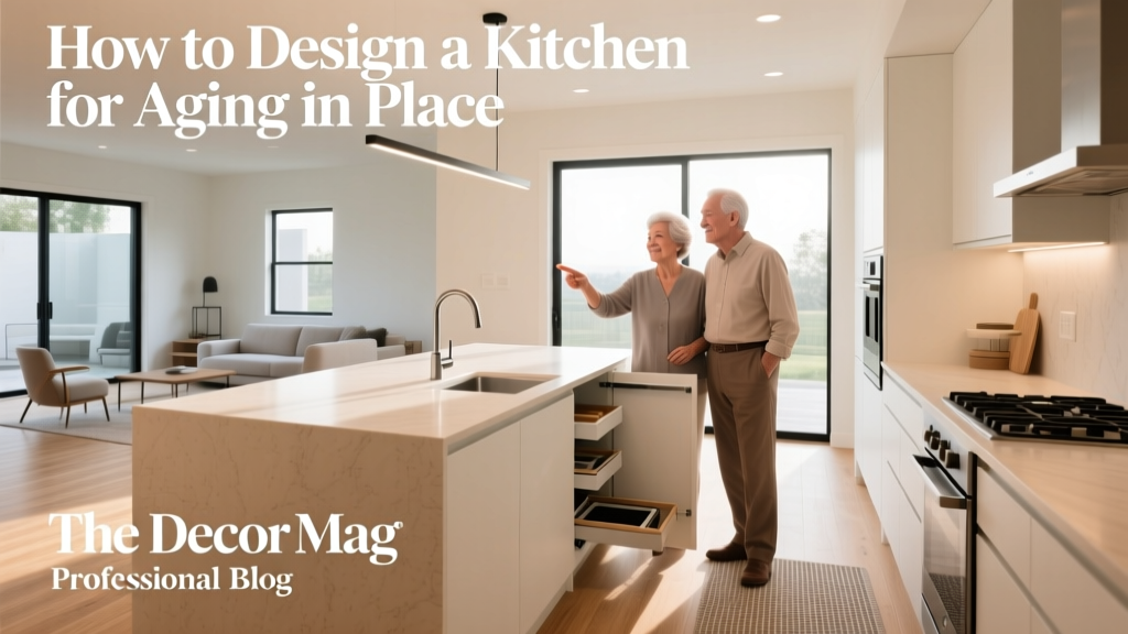 How to Design a Kitchen for Aging in Place - The Decor Mag
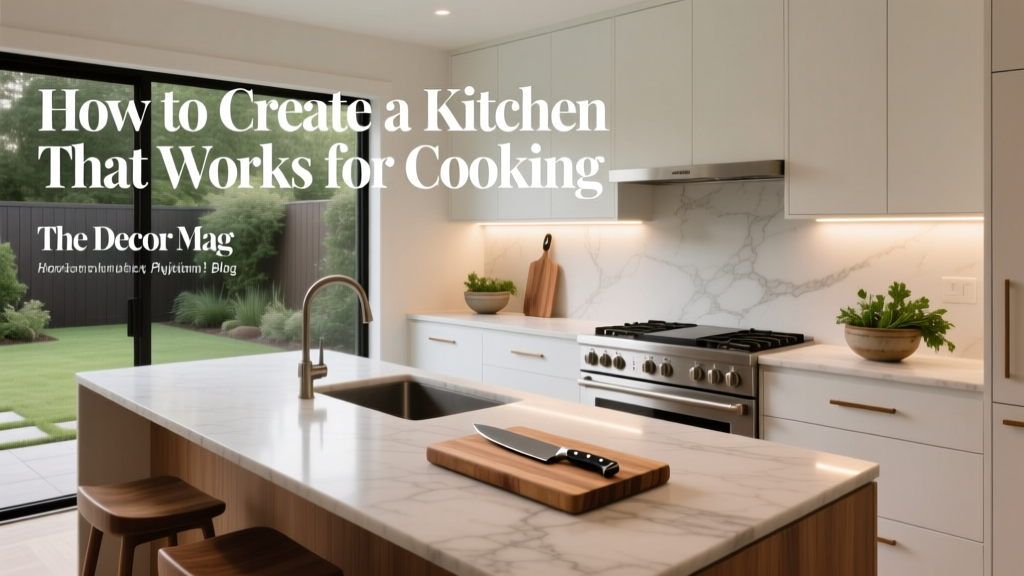 Kitchen Design for Cooking: Functional Ideas (2026)
 Safety vs. Bedside: Why Kitchen Layout Decisions Must Prioritize Human Factors Over Aesthetic Convenience
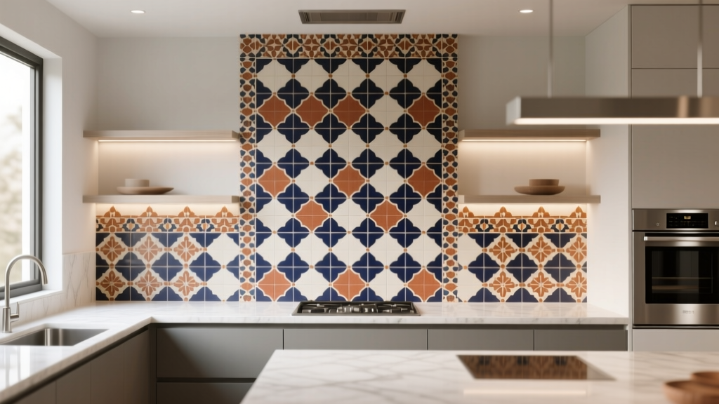 Kitchen Zellige Tile Backsplash Guide - The Decor Mag
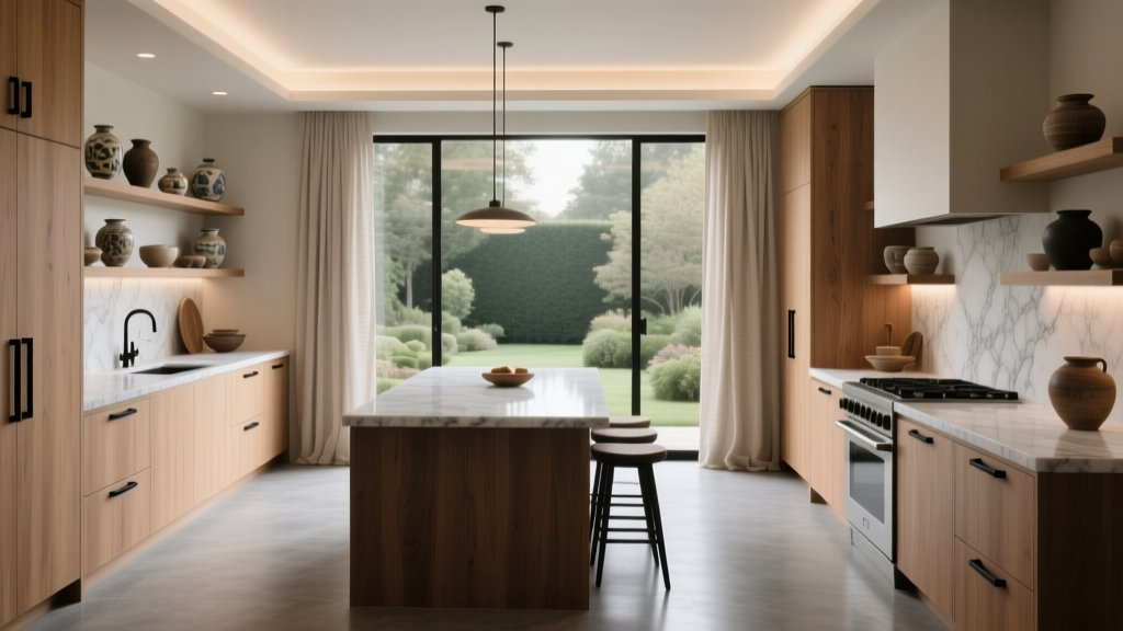 How to Create a Kitchen That Feels Timeless - The Decor Mag
 Best Kitchen Knife Block Storage Solutions - The Decor Mag
 Best Kitchen Pot Lid Organization - The Decor Mag