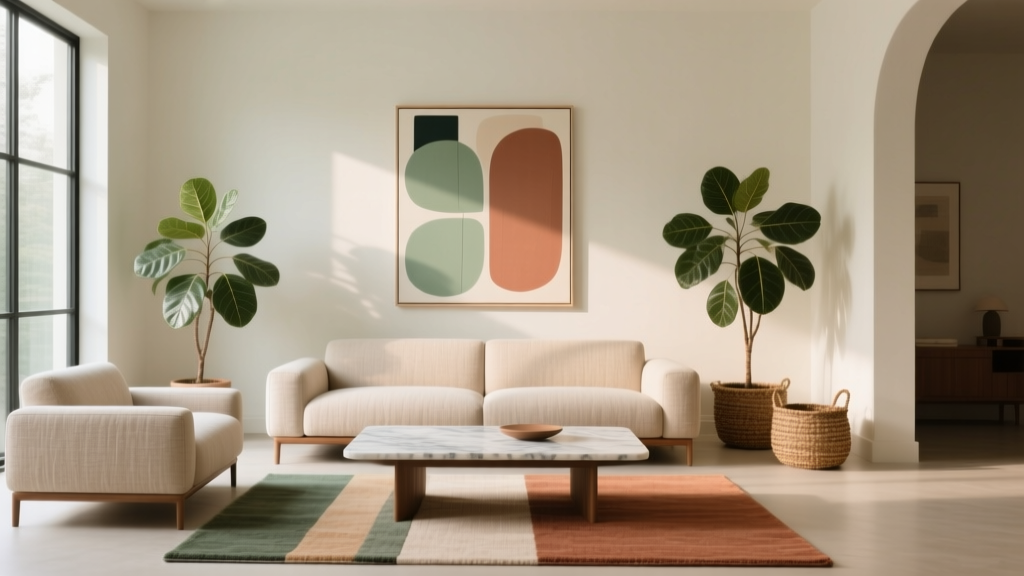
How to Create a Living Room Color Story - The Decor Mag
A living room can have beautiful furniture and stylish decor and still feel a little “off” if the colors don’t relate to one another. That’s where a color story comes in. Think of it as the quiet thread that makes your sofa, rug, art, walls, and accessories feel like they belong in the same room—without everything matching.
The good news: you don’t need an interior design degree (or a full renovation budget) to build a cohesive living room color palette. You just need a clear plan: a few anchored colors, a consistent undertone, and repeatable accents that show up in the right places. This guide walks you through choosing your base, building a palette, layering materials, and styling the room so it feels polished, personal, and easy to live in.
By the end, you’ll know how to create a living room color scheme that works for your lighting, your existing pieces, and your lifestyle—whether you’re a homeowner investing long-term or a renter who needs removable, budget-friendly upgrades.
What a “Color Story” Really Means (and Why It Works)
A living room color story is the intentional relationship between:
- Background colors: walls, large rugs, drapery
- Mid-tone colors: sofa upholstery, accent chairs, cabinets, built-ins
- Accent colors: pillows, throws, art, books, ceramics, greenery, lampshades
- Neutrals and metals: wood tones, black details, brass, chrome, nickel
When these categories are coordinated, the room feels calm, elevated, and “finished.” When they’re random, even expensive pieces can look disconnected. A strong color story also makes future decorating easier—because every new pillow, print, or side table has a clear lane.
Step-by-Step: Build a Living Room Color Palette That Holds Together
Step 1: Start with One Anchor You Already Love
The easiest way to avoid decision fatigue is to begin with a hero item:
- A rug (especially if it’s patterned)
- A piece of art you want to highlight
- A sofa color you’re keeping
- A fireplace surround or wood floor tone you can’t change
Real-world scenario: You’re renting and can’t paint. Use a large rug (8' x 10' for most living rooms) as the anchor, then pull 2–3 colors from it to repeat in pillows, art, and curtains.
Tip: If you’re shopping from scratch, choosing the rug first often produces the most cohesive living room design—because it’s the largest “pattern and color” decision you’ll make.
Step 2: Choose a Base Neutral (Your “Canvas”)
Your base neutral keeps the room from looking chaotic. It doesn’t have to be white—just consistent. Popular (and timeless) options include:
- Warm neutrals: ivory, cream, sand, greige, mushroom
- Cool neutrals: crisp white, cool gray, soft charcoal
- Moody neutrals: deep taupe, slate, near-black
Measurements that matter:
- Walls: If painting, pick a neutral that works across the largest surfaces. In open-plan homes, use one main neutral through shared spaces for flow.
- Rugs: Aim for at least the front legs of all seating on the rug. Typical sizes: 8' x 10' for standard living rooms, 9' x 12' for larger rooms.
- Curtains: Hang rods 4–6 inches above the window frame (or closer to the ceiling for height) and extend 6–10 inches past each side so panels stack back and let in light.
Trend + timeless note: Warm neutrals are especially current right now (creamy whites, soft beiges, clay tones), but they’re also classic when paired with natural materials like oak, linen, and stone.
Step 3: Add Two Supporting Colors (Mid-Tones) for Depth
A reliable formula for a balanced living room color scheme is:
- 1 base neutral (dominant)
- 2 supporting colors (mid-tone, used in larger pieces)
- 1–2 accent colors (pops, repeated in small doses)
Supporting colors create dimension. Examples that work in a wide range of styles:
- Greige base + olive + soft black (organic modern, elevated)
- Cream base + navy + camel (classic, tailored)
- Warm white base + terracotta + walnut (earthy, inviting)
- Light gray base + dusty blue + charcoal (quiet, contemporary)
Where to use supporting colors: sofa upholstery, an accent chair, a painted console, a feature wall, or a large throw blanket.
Step 4: Pick Your Accent Color(s) and Repeat Them Intentionally
Accent colors are where personality lives. The key is repetition—using the same accent 3–5 times throughout the room so it feels intentional, not random.
Easy accent options:
- Rust, cinnamon, or terracotta (warm and grounded)
- Sage or emerald (fresh, nature-inspired)
- Ink blue (rich without being loud)
- Blush or mauve (soft, modern romantic)
- Mustard or ochre (adds energy, especially with warm neutrals)
Quick styling checklist (repeat the accent):
- One pillow or throw
- One piece of art (even a small print)
- One decorative object (vase, bowl, candle)
- One subtle element (book spine, plant pot, lampshade trim)
Step 5: Match Undertones (This Is What Makes a Room Feel “Right”)
Undertones are the reason some beige paints look pink, some look yellow, and some look gray. Matching undertones is a cornerstone of professional-looking living room decor.
How to check undertones:
- Compare paint swatches against a true white sheet of paper.
- Look at your fixed finishes: floors, brick, countertops, large wood furniture.
- Test paint on at least two walls (one sunny, one shaded). View morning, afternoon, and evening.
Common undertone pairings:
- Warm floors (honey oak, reddish wood): creamy whites, warm greige, camel, olive
- Cool floors (gray wood, slate tile): crisp whites, cool grays, navy, charcoal
- Neutral floors (natural oak, medium walnut): most palettes work—focus on consistent metals and textiles
Step 6: Layer Materials and Finishes (Texture = Color’s Best Friend)
Even a simple palette becomes high-end when you vary texture. This is a major trend in 2025 living room design—quiet luxury, organic modern, and elevated minimalism all rely on tactile materials.
Material recommendations that add depth:
- Upholstery: performance linen, cotton velvet, bouclé (use bouclé in low-spill homes)
- Rugs: wool for longevity; wool-blends for budget; jute/sisal for texture (add a soft topper rug if you want more comfort)
- Wood tones: limit to 1–2 main wood finishes for cohesion (example: oak + walnut accents)
- Metals: pick one dominant (brass or black is especially popular), then add a secondary sparingly
- Soft goods: linen curtains, chunky knits, mohair throws, matte ceramic accessories
Practical tip: If your palette feels flat, don’t add more colors—add more textures.
Product-Level Guidance: Where to Spend vs. Save
A cohesive living room color story doesn’t require a huge budget. It requires smart allocation.
Spend (or invest) on the big anchors
- Sofa: $1,200–$3,500 (look for kiln-dried hardwood frames and removable cushion covers if possible)
- Rug: $400–$1,500 for an 8' x 10' (wool is worth it if you can swing it)
- Window treatments: $200–$800 depending on panel quality and width; prioritize full-looking drape (generous fabric) over ultra-cheap thin panels
Save on the “color story repeaters”
- Pillows and throws: $20–$80 each (mix solids + subtle patterns)
- Art prints: $30–$200 (upgrade with a larger frame and mat)
- Ceramics and decor: $10–$60 (thrift stores are excellent for vases and bowls)
Renter-friendly upgrades that change the palette fast
- Peel-and-stick wallpaper on a focal wall or behind shelving ($60–$300 per area)
- Slipcovers or sofa throws in a palette-friendly color ($40–$250)
- Removable plug-in sconces or a statement floor lamp ($80–$300)
Real-World Color Story Examples (Steal These)
Example 1: Small apartment living room with low light
- Base: warm off-white walls + light rug
- Supporting: camel leather (or faux leather) chair + walnut-toned coffee table
- Accent: olive (pillows, one art element, a ceramic vase)
- Why it works: warm neutrals prevent the room from feeling cold; olive reads rich even in dimmer light
Measurement tip: Use a larger rug than you think—8' x 10' often makes a small space feel bigger by visually unifying furniture.
Example 2: Family living room that needs to hide wear and tear
- Base: medium warm greige walls
- Supporting: performance fabric sofa in a heathered oatmeal + black metal accents
- Accent: rust and denim blue (kid-friendly, forgiving)
- Why it works: mid-tone base hides scuffs; heathered textiles disguise stains better than flat solids
Material tip: Choose performance fabric or washable slipcovers if pets or kids are in the mix.
Example 3: Open-plan living room that needs flow into the kitchen
- Base: consistent wall color throughout
- Supporting: pull one cabinet or backsplash tone into the living room (example: navy island echoed in pillows)
- Accent: brass repeated in lighting, frames, and hardware
- Why it works: repeated finishes create continuity without making spaces look identical
Common Mistakes to Avoid When Creating a Living Room Color Story
- Choosing paint first without considering the rug and upholstery. Paint is easiest to change; textiles are harder.
- Mixing warm and cool undertones randomly. A warm beige next to a cool gray often looks “dirty” or mismatched.
- Too many accent colors. If everything is a “pop,” nothing is. Limit to 1–2 accents and repeat them.
- Ignoring scale. Tiny rug + large furniture breaks the visual story. Aim for a rug that sits under seating legs.
- Matching everything exactly. A good color story uses variation: different shades of the same family, layered textures, and a mix of solids/patterns.
- Forgetting about lighting. LEDs come in different color temperatures; mismatched bulbs can make your palette look off.
Quick Styling Formula: Make the Color Story Feel Finished
Use this room-by-room checklist to pull everything together:
- Choose your palette: base neutral + two supporting + one accent
- Repeat the accent 3–5 times across the room (pillow, art, accessory, textile)
- Keep metals consistent (dominant + secondary)
- Balance light and dark: if your sofa is light, add a darker coffee table or accents for contrast
- Add one pattern (rug, pillow, or drapery) that includes at least two palette colors
- Finish with greenery (plants act like a “neutral” and soften hard edges)
Lighting tip (specific and practical): For living rooms, aim for bulbs around 2700K for a warm, inviting glow. Use matching color temperature across lamps and overheads so your wall color and textiles read consistently.
FAQ: Living Room Color Stories
How many colors should a living room color scheme have?
A strong living room color palette typically has 3–5 colors: one base neutral, two supporting mid-tones, and one or two accents. More than that can work, but it’s harder to keep cohesive.
Should the rug match the sofa?
They don’t need to match, but they should relate. Look for a shared undertone (warm vs. cool) or a repeated color. A patterned rug can bridge a neutral sofa with bolder accents.
What’s the easiest way to refresh a living room color story on a budget?
Swap the repeatable accents: pillow covers, a throw, an oversized print, and a couple of decor pieces. Budget range: $150–$500 can make a noticeable difference if your base items stay the same.
How do I choose paint if my living room gets different light throughout the day?
Test large swatches (at least 12" x 12") on multiple walls and check them morning, afternoon, and evening. If your light shifts a lot, choose a neutral with balanced undertones (avoid extremes that look too yellow or too blue).
What are the most current living room color trends right now?
Warm whites, earthy neutrals, clay and terracotta accents, olive and sage greens, and deep, moody blues are especially popular. The trend direction leans toward organic modern and quiet luxury: fewer colors, richer textures, and more natural materials.
Can I mix wood tones and still have a cohesive color story?
Yes—mixing wood tones adds depth. Keep it intentional by limiting to one main wood tone and one supporting tone, and repeat each at least twice (example: oak side table + oak frames; walnut coffee table + walnut bowl).
Your Next Steps: Create Your Color Story This Weekend
If you want a clear, doable plan, try this:
- Photograph your living room in daylight and at night.
- Pick your anchor (rug, art, or sofa) and identify 2–3 colors within it.
- Choose one base neutral and commit to it across the largest surfaces.
- Select one accent color and repeat it 3–5 times with pillows, art, and accessories.
- Check undertones and swap bulbs to 2700K for consistent warmth.
A thoughtful living room color story doesn’t just make a room prettier—it makes it easier to live in, easier to shop for, and easier to keep feeling fresh. For more living room design and decor ideas, explore the latest inspiration and how-tos on thedecormag.com.
More Articles
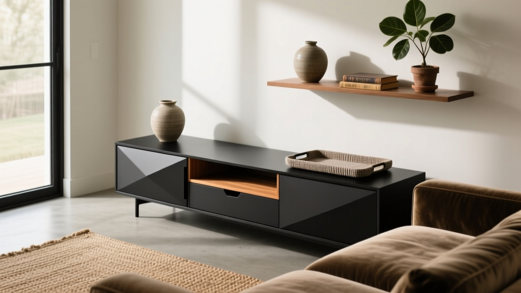 Best Console Styling for Behind Couch - The Decor Mag
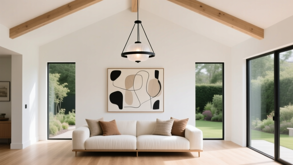 Living Room Decor for High Ceilings (2026)
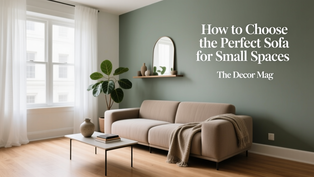 Sofa for Small Spaces: Best Picks (2026)
 Mix Metal Finishes in Living Room Hardware (2026)
 Living Room Fireplace Styling Ideas (2026)
 7 Living Space Design Mistakes to Avoid
 Hardwood vs Engineered vs Laminate Living Room Floors
 Living Room Window Treatments for Privacy (2026)
 Best Bedroom Layout Ideas 2026: Stylish & Space-Smart
 Science-Backed Room Design Principles for 2026