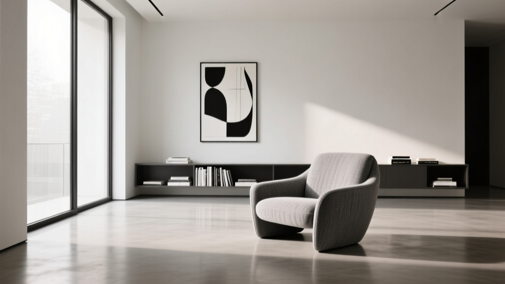
Living Room Monochromatic Design Guide - The Decor Mag
A monochromatic living room can feel effortlessly elevated—calm, cohesive, and surprisingly personal. When everything lives in one color family, the space stops feeling “decorated” and starts feeling designed. It’s a go-to approach for homeowners who want a polished look and renters who need a high-impact refresh without major renovations.
The secret is that monochromatic doesn’t mean “all the same.” The best monochrome rooms rely on contrast in texture, sheen, shape, and tone. In this guide, you’ll learn how to choose the right base color, layer shades like a pro, add depth with materials, pick furniture and decor that won’t blend into a blur, and avoid the common pitfalls that make monochrome feel flat or sterile.
Expect practical measurements, budget ranges, real-world room scenarios, and product-style recommendations you can apply whether you’re styling a studio apartment or a family living room.
What “Monochromatic” Actually Means (and Why It Works)
A monochromatic color scheme uses one hue (like blue, beige, or green) and builds a full palette using:
- Tints (the hue + white): softer, airier versions
- Tones (the hue + gray): muted, sophisticated versions
- Shades (the hue + black): deeper, moodier versions
Why it works in living room design:
- Visual calm: Fewer competing colors reduces visual noise—ideal for busy households or small spaces.
- Instant cohesion: Furniture, textiles, and decor feel intentionally curated.
- Flexible styling: You can swap pillows, throws, and art without rethinking the entire room.
Step-by-Step: Build a Monochromatic Living Room That Has Depth
Step 1: Pick Your Base Hue (Start with the Room’s Reality)
Choose a hue that aligns with your room’s fixed elements and daily use. Ask yourself:
- Do you want the room to feel energizing (warm neutrals, terracotta, sun-washed yellow) or restful (blue-gray, sage, greige)?
- Is your space naturally bright or low-light?
- Are you working around a warm wood floor, cool gray tile, or existing sofa?
Quick guidance by light:
- North-facing / low natural light: warmer monochromes (camel, warm taupe, clay, creamy off-white) help prevent a dull look.
- South-facing / bright light: cooler monochromes (soft gray, blue-gray, sage, charcoal) stay balanced.
Trend + timeless picks: warm neutrals (sand, oatmeal, mushroom), earthy greens (sage, olive), and “moody monochrome” charcoals are current design trends that also age well.
Step 2: Choose 5–7 Tones Within the Same Family
One of the easiest ways to make monochromatic living room decor look intentional is to pre-plan a mini palette:
- Wall color: your dominant tone
- Ceiling/trim tone: slightly lighter or same color in different sheen
- Largest upholstery: sofa or sectional tone
- Secondary upholstery: accent chair/ottoman
- Textiles: rug, curtains, pillows
- Accent layer: art, vases, throws
- Anchor: a deeper shade for contrast (coffee table base, frames, lamp, or one statement piece)
Rule of thumb: include at least one deep shade and one crisp light tint so the room has a “full range,” not just mid-tones.
Step 3: Use Texture Like Color (It’s Non-Negotiable)
Texture is what stops a monochrome living room from feeling flat. Mix at least 6–8 different textures across the room.
Texture pairings that always work:
- Matte paint + linen curtains (soft and airy)
- Bouclé or chenille upholstery + smooth leather (cozy meets structured)
- Wool rug + natural wood (warm, timeless)
- Stone or marble accent + brushed metal (adds sophistication)
- Ribbed glass + ceramic (subtle shine + earthy weight)
Material recommendations:
- Rugs: wool (best durability), wool-blend (mid-range), polypropylene (budget-friendly and easy to clean)
- Curtains: linen or linen-blend for softness; blackout lining if your room doubles as a media space
- Accent tables: oak, walnut, travertine-look stone, or powder-coated metal for modern monochrome
Step 4: Get the Big Measurements Right (Layout Makes Monochrome Shine)
Because color contrast is subtle in monochromatic spaces, proportion and spacing matter more.
- Rug sizing:
- Most living rooms look best with an 8' x 10' rug (standard seating area).
- Larger rooms often need a 9' x 12'.
- Aim for at least the front legs of the sofa and chairs on the rug.
- Coffee table distance: keep 14–18 inches between sofa and table.
- Walkways: maintain 30–36 inches for main paths when possible (24 inches works in tight apartments).
- Curtain placement: mount the rod 4–8 inches above the window frame (or closer to the ceiling for height). Extend 6–10 inches past each side of the window to make it look larger.
- Art height: center artwork around 57–60 inches from the floor (gallery standard), adjusting for furniture height.
Step 5: Add Contrast with Shape, Sheen, and Pattern (Not More Colors)
You can keep a monochromatic color palette while still adding plenty of interest:
- Shape contrast: Pair a boxy sofa with a round coffee table, or add a curved accent chair to soften lines.
- Sheen contrast: Mix matte walls with satin pillows, glossy ceramics, or a lacquered side table.
- Pattern within the palette: Think tonal stripes, subtle geometrics, tone-on-tone florals, or a textured rug pattern.
Pattern tip: Keep patterns in the same hue family but vary scale. Example: a large-scale tonal rug + small-scale textured pillows.
Monochromatic Color Schemes That Work in Real Homes
Scenario 1: The Small Rental Living Room (Warm Neutral Monochrome)
The challenge: White walls, limited storage, and a tight budget—yet you want it to look intentional.
The plan: Use a warm neutral monochromatic scheme (oatmeal to camel) to add softness without painting.
- Sofa: light beige or oatmeal slipcover look (practical for renters and pets)
- Rug: 8' x 10' in a tonal pattern (ivory + sand)
- Window treatments: linen-blend curtains in warm white
- Accents: camel leather (or faux leather) pouf, wood tray, ceramic vases in cream
- Lighting: floor lamp in brushed brass or black (metal reads as “neutral” but adds definition)
Budget range: $400–$1,500 depending on whether you’re replacing the sofa. You can get most of the look with a rug, curtains, and layered pillows.
Scenario 2: The Family Living Room (Greige Monochrome That Hides Real Life)
The challenge: You need durability, stain resistance, and a style that won’t feel dated next year.
The plan: A greige monochromatic palette (warm gray-beige) with performance fabrics.
- Upholstery: performance fabric sectional in mid-tone greige
- Rug: low-pile, stain-resistant option (polypropylene or washable rug) in layered greige tones
- Walls: if painting, choose a soft greige in matte; keep trim a clean warm white
- Storage: closed media console in light oak or painted greige (reduces visual clutter)
- Decor: mix cozy knits, boucle pillows, and a few darker accents (charcoal frames, smoky glass)
Budget range: $1,500–$6,000 depending on sectional and built-in storage.
Scenario 3: The Modern Moody Lounge (Charcoal Monochrome Done Right)
The challenge: Dark monochrome can quickly feel cave-like or heavy.
The plan: Layer charcoal and slate with strategic lighting and reflective surfaces.
- Walls: charcoal or deep slate in matte (adds sophistication)
- Sofa: slightly lighter gray than the walls (so it doesn’t disappear)
- Rug: tonal low-contrast pattern to keep it grounded
- Lighting: at least three sources—overhead, floor lamp, and table lamp (warm bulbs, 2700K)
- Accents: smoked mirror tray, ribbed glass, blackened metal, and one large-scale art piece in tonal grayscale
Budget range: $900–$4,500 depending on paint, lighting, and upholstery upgrades.
Product-Style Recommendations (What to Look For When Shopping)
Rather than chasing exact items, shop by specs. These details consistently create an upscale monochromatic look:
- Sofa: textured weave, bouclé, or chenille in a mid-tone; choose a performance fabric if you have kids/pets.
- Rug: 8' x 10' minimum for most seating areas; consider wool for longevity or a washable option for high-traffic rooms.
- Throw pillows: mix 20" x 20" with lumbar (12" x 20") for shape variety; aim for 3–5 pillows on a standard sofa.
- Curtains: panels wide enough to look full; total curtain width should be about 2x the window width for a luxurious gather.
- Lighting: warm bulbs (2700K) for cozy neutrals; add a dimmer or smart bulb to control mood.
- Art: go larger than you think—over a sofa, aim for art that’s about 2/3 the sofa width.
Common Mistakes to Avoid in Monochromatic Living Room Decor
- Using only one tone: If everything is the same mid-tone, the room feels muddy. Add a crisp light and a true deep shade.
- Skipping texture: Monochrome needs tactile variety—especially in pillows, rugs, and window treatments.
- Choosing the wrong undertone: Mixing warm and cool versions of the same “neutral” can clash (for example, cool gray walls with warm beige rug). Pick a lane: warm, cool, or balanced.
- Too many small decor items: Tonal decor can read as clutter. Fewer, larger pieces look more intentional.
- Not enough lighting: Dark or muted palettes need layered lighting. One ceiling fixture won’t do it.
- Forgetting contrast: If the sofa, rug, and walls are too close in value, everything blends. Introduce contrast through a darker coffee table base, bold frames, or a deeper throw.
Quick Styling Formulas (Copy-and-Paste Looks)
The “Soft Neutral” Monochrome Formula
- Walls: warm white
- Sofa: oatmeal
- Rug: ivory + sand tonal pattern
- Accents: light oak, cream ceramics, warm brass
- Textiles: linen curtains, knit throw
The “Earthy Green” Monochrome Formula
- Walls: pale sage
- Sofa: muted olive or moss
- Rug: oatmeal or sage-tonal weave
- Accents: walnut, aged brass, stoneware
- Plants: lean into it—greens enhance the scheme without feeling like “another color”
The “Modern Gray” Monochrome Formula
- Walls: light gray with a consistent undertone
- Sofa: medium gray textured fabric
- Rug: tonal geometric in gray/ivory
- Accents: black frames, chrome or brushed nickel lighting, ribbed glass
FAQ: Monochromatic Living Room Design
Is monochromatic the same as neutral?
No. Neutral living room design uses colors like white, beige, gray, and black. Monochromatic means one hue family—your monochrome can be neutral (greige) or colorful (blue, green, terracotta) as long as it stays within that hue’s tints, tones, and shades.
How do I keep a monochrome living room from looking boring?
Use texture, sheen, and scale changes. Add at least one statement material (like a chunky knit throw, bouclé chair, or stone side table) and one deeper accent for contrast (frames, lamp base, or coffee table).
Can I mix wood tones in a monochromatic space?
Yes—wood is a “neutral material,” not a competing color. Keep it cohesive by limiting to two main wood tones (for example, light oak + walnut) and repeating each at least twice (coffee table and frames, or console and side table).
What’s the easiest monochromatic update without buying new furniture?
Start with textiles and lighting: a larger rug, full-length curtains, and a few tonal pillows in varied textures. Swap harsh bulbs for warm 2700K and add a floor lamp for depth.
Should the walls match the sofa in monochromatic living room decor?
They can, but it’s usually more flattering when the sofa is either slightly lighter or slightly darker than the wall. A difference of a few shades helps the sofa stand out while still feeling cohesive.
Does monochromatic work in open-concept spaces?
It works beautifully. Use the same hue family throughout the living area and shift the tones slightly between zones (lighter in dining, deeper in living) to create separation without breaking flow.
Next Steps: Create Your Monochrome Plan in One Afternoon
If you want a monochromatic living room that feels designer-level (not one-note), keep it simple:
- Pick your base hue and confirm whether it’s warm or cool.
- Choose 5–7 tones (light to deep) and stick to them while shopping.
- Layer texture: rug, curtains, pillows, throws, and one standout material.
- Check your measurements (especially rug size and curtain placement).
- Add contrast with shape and sheen—then edit down small decor.
For more living room design and decor ideas—from layout tips to trend-forward color palettes—explore the latest inspiration on thedecormag.com.
More Articles
 Best Side Chair Styles to Complement a Sofa - The Decor Mag
 Living Room Cozy Reading Corner Inspiration - The Decor Mag
 Designing a Workspace That Fuels Creativity
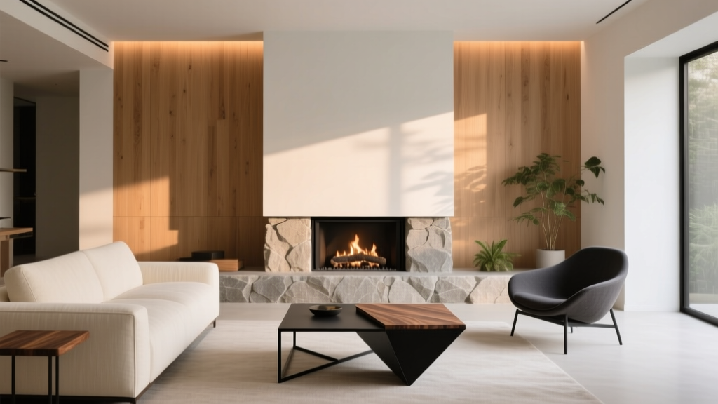 Living Room Fireplace Design Ideas - The Decor Mag
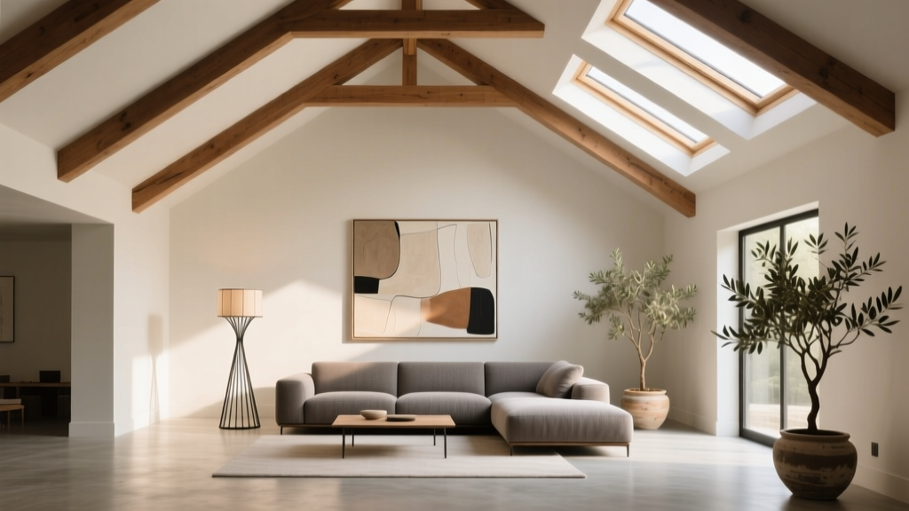 Living Room Vaulted Ceilings: Styling Tips (2026)
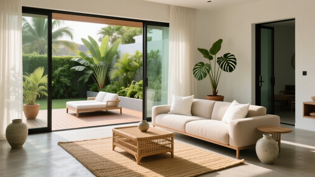 Living Room Indoor-Outdoor Flow: Summer 2026
 Colorguides for Living Spaces: Step-by-Step Guide 2026
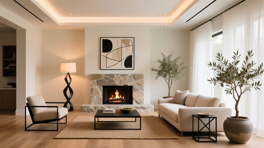 Living Room Fireplace Styling Ideas (2026)
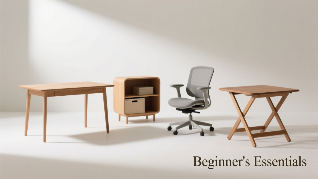 Best Furniture for First Home in 2026: Smart & Sustainable
 Living Room Design: Functional + Stylish Framework (2026)