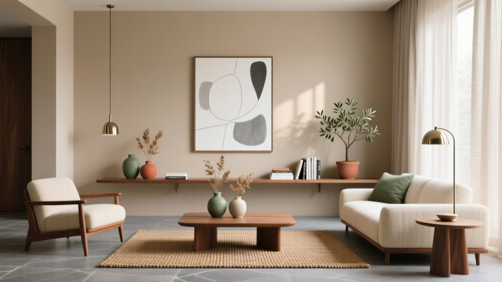
Living Room Warm vs Cool Tone Balancing - The Decor Mag
Your living room does a lot of heavy lifting. It’s where you unwind after work, host friends, binge shows, and (if you’re like most of us) juggle multiple functions in one space. When a living room feels “off,” the culprit is often color temperature—too many warm tones can feel muddy or dated, while an overload of cool tones can read sterile and uninviting.
Balancing warm and cool tones is one of the most reliable, designer-approved ways to make a living room feel polished, comfortable, and intentional—without a full renovation. The best part: you can apply these ideas whether you rent or own, whether you’re working with a compact apartment layout or a sprawling open-concept space.
This guide breaks down how warm and cool tones behave, how lighting changes everything, and how to build a cohesive palette using paint, furniture, textiles, and finishes. You’ll also get real-world scenarios, common mistakes to avoid, and practical steps (with measurements and budget ranges) to help you put the plan into action.
Warm vs Cool Tones: What They Are (and Why They Change the Mood)
Warm tones
Warm tones have yellow, red, or orange undertones. They feel cozy, welcoming, and grounded—great for rooms where you want people to linger.
- Color examples: cream, ivory, camel, terracotta, rust, honey oak, warm beige, warm greige, olive-leaning greens
- Material cues: walnut, oak, rattan, brass, cognac leather, jute, terracotta, warm veined marble (Calacatta Gold-style)
Cool tones
Cool tones have blue, green, or violet undertones. They read crisp, airy, and modern, and they visually “recede,” which can make a space feel larger.
- Color examples: charcoal with blue undertones, cool gray, navy, teal, emerald, icy whites, blue-leaning greige
- Material cues: chrome, nickel, stainless steel, concrete, blackened steel, cooler marbles (Carrara-style), slate
The magic is in the mix
Most living rooms feel best when they include both warm and cool elements. Warmth adds comfort; coolness adds clarity. Think of it like seasoning: you’re aiming for balance, not equality.
Start With Light: The Factor That Changes Every Color
Before you pick paint or textiles, look at the light. A warm/cool palette that looks perfect online can flip in your room depending on daylight exposure and bulb temperature.
Identify your natural light direction
- North-facing rooms: Cooler, flatter light. Warm tones help counteract chilliness.
- South-facing rooms: Warm, bright light. Cool tones can keep things from feeling overly yellow.
- East-facing rooms: Warm morning light, cooler afternoons. Balanced palettes work best.
- West-facing rooms: Cooler mornings, very warm afternoons. Avoid going too warm on walls if you get strong late-day sun.
Choose bulb color temperature intentionally
Lighting is one of the fastest ways to correct a room that’s “too cool” or “too warm.”
- 2700K: Warm, cozy (classic “soft white”). Best for warm-toned living rooms or evening-focused spaces.
- 3000K: Neutral-warm (a sweet spot for most living rooms). Clean but still inviting.
- 3500K+: Cooler/whiter. Can feel modern, but risks looking harsh in living spaces.
Practical tip: Use at least three light sources in a living room—overhead + table lamp + floor lamp—so the space feels layered and flattering. If you’re renting, plug-in sconces are a trend-forward way to add height and warmth without wiring.
The 60–30–10 Rule (Adjusted for Warm/Cool Balance)
Designers often use the 60–30–10 rule for color distribution. It works beautifully for warm vs cool tone balancing when you treat “temperature” as part of the formula.
- 60%: Dominant temperature (walls + large rugs + main upholstery)
- 30%: Secondary temperature (accent chairs, curtains, secondary textiles)
- 10%: Contrast temperature (art, pillows, decor accents, one bold finish)
Example: If your sofa is a cool light gray (60%), bring in warmth with a walnut coffee table and warm rug tones (30%), then add a cool punch with deep navy pillows or artwork (10%).
Step-by-Step: How to Balance Warm and Cool Tones in Your Living Room
Step 1: Pick an anchor piece and identify its undertone
Your anchor is usually the sofa, a large rug, or a wall color. Stand near a window and ask: does it lean yellow/red (warm) or blue/green (cool)? If you’re unsure, compare it to a true white sheet of paper.
Step 2: Choose a “bridge neutral”
Bridge neutrals connect warm and cool elements so the room doesn’t feel split. Great bridge neutrals include:
- Greige (a true mix of gray and beige)
- Warm white (creamy but not yellow)
- Taupe (often works with both wood tones and cool upholstery)
Step 3: Layer materials to do the balancing for you
Materials are often easier than paint when you want a quick temperature correction.
- To warm up a cool room: add walnut/oak, leather, brass, boucle, warm-toned art, and textured rugs (jute/wool blends).
- To cool down a warm room: add black accents, cooler marble, nickel/chrome, crisp linen, and blue/green-based textiles.
Step 4: Repeat each temperature at least three times
This is a timeless principle: repetition creates cohesion. If you introduce a cool navy, echo it in at least two other places (art + pillow + vase). Same for warm brass (lamp + frame + tray).
Step 5: Check the room at night
Many living rooms look balanced in daylight and skew overly warm under evening lamps. Test your palette after sunset with your usual lighting on. If everything turns yellow, swap bulbs to 3000K or add a cooler accent (charcoal throw, black frame, slate pillow).
Paint and Color Pairings That Rarely Fail
Paint is a high-impact, relatively affordable change. If you’re renting, use this section to guide large-scale decor (curtains, rugs) in place of paint.
Timeless warm + cool combinations for living rooms
- Warm white walls + cool charcoal accents (frames, metal, a media console)
- Cool light gray walls + warm wood furniture (walnut coffee table, oak sideboard)
- Greige walls + navy textiles (curtains, pillows) + brass lighting
- Warm beige walls + deep green (velvet chair, art) + black accents
Paint planning measurements (so it looks intentional)
- Rug size: Aim for 8' x 10' in most living rooms; front legs of sofa and chairs should sit on the rug (at minimum). For larger rooms, 9' x 12' creates a more upscale feel.
- Curtain height: Hang rods 4–6 inches above the window frame (or closer to the ceiling for added height). Curtains should kiss the floor or “break” by 1/2 inch.
- Art placement: Center artwork at about 57–60 inches from the floor (gallery standard). Over a sofa, art should be roughly 2/3 the sofa width.
Product and Material Recommendations (With Budget Ranges)
Balancing warm and cool tones doesn’t require designer-only pieces. It’s more about choosing the right finishes, textures, and a few strategic swaps.
Rugs (the quickest temperature corrector)
- Warm-up option: wool or wool-blend rug in ivory/camel/terracotta accents
- Cool-down option: rug with gray/charcoal base and subtle blue patterning
- Budget range: $150–$400 (synthetic), $450–$1,200 (wool/wool-blend), $1,200+ (hand-knotted)
Lighting (where warm/cool tone balance is won or lost)
- Warm finishes: aged brass, antique bronze
- Cool finishes: polished nickel, chrome, matte black (often reads “cool modern”)
- Budget range: $30–$120 (table lamps), $120–$350 (floor lamps), $150–$600 (statement ceiling fixtures)
Textiles (pillows, throws, curtains)
- Warm textures: boucle, mohair-style throws, velvet in rust/olive, woven linen in flax
- Cool textures: crisp linen in white/gray, velvet in navy/emerald, cotton in blue-based patterns
- Budget range: $20–$60 per pillow cover, $40–$150 throws, $60–$300 curtain panels (set depends on length and fabric)
Furniture finishes
- Add warmth: walnut, smoked oak, cane/rattan, cognac leather
- Add cool: blackened metal, glass, concrete-look tops, cool marbles
- Budget range: $150–$400 side tables, $250–$900 coffee tables, $700–$2,500 sofas (depending on size and upholstery)
Real-World Scenarios: How Balancing Warm and Cool Looks in Practice
Scenario 1: The “Too Gray” rental living room
The problem: Cool gray walls, gray sofa, gray rug—clean but flat and cold.
Fix (renter-friendly):
- Swap to a rug with warm ivory and tan undertones (8' x 10' if possible).
- Add a walnut-tone coffee table or a wood tray on an existing table.
- Use brass or warm bronze lamps with 2700K–3000K bulbs.
- Introduce warm textiles: camel throw, rust/ivory pillows, natural linen curtains.
Result: The room still feels modern, but now it’s inviting and dimensional.
Scenario 2: The “All Beige” cozy living room that feels dated
The problem: Beige walls, tan sofa, warm wood everywhere—comfortable but lacking contrast.
Fix:
- Add cool accents in small doses: matte black curtain rod, charcoal frames, navy pillows.
- Bring in a cool-toned statement art piece (blues/greens) above the sofa.
- Consider a cooler rug pattern (ivory base with gray/blue detailing).
Result: Still warm and welcoming, but sharper, more current, and visually interesting.
Scenario 3: Open-concept living room blending into a kitchen
The problem: Kitchen has cool finishes (stainless, white quartz), living area has warm wood and beige upholstery—feels disconnected.
Fix:
- Repeat kitchen metals in the living room (nickel floor lamp, stainless decor accents).
- Repeat living room warmth in the kitchen via wood stools or a warm runner.
- Use a bridge neutral (greige) through pillows and throws to tie zones together.
Result: The space reads cohesive even with mixed finishes—a very current design trend.
Current Design Trends That Support Better Tone Balance
- Warm minimalism: clean lines + warmer neutrals + natural textures (linen, oak, plaster-like finishes).
- Mixed metals: brass + black, or nickel + brass, used with intention (repeat each finish at least 2–3 times).
- Color-drenched accents: a deep cool color (navy/forest) paired with warm wood and creamy walls.
- Biophilic touches: plants and organic materials naturally bridge warm and cool palettes.
Common Mistakes to Avoid
- Assuming “neutral” means undertone-free: grays can be blue, green, or purple; beiges can be yellow or pink. Undertones matter.
- Matching everything to the same temperature: an all-warm or all-cool room often looks one-dimensional.
- Ignoring lighting temperature: a 4000K bulb can make a cozy palette feel clinical, while overly warm bulbs can make whites look dingy.
- Mixing woods without a plan: two wood tones can look intentional; five random tones can look chaotic. Aim for 2–3 wood finishes max and repeat them.
- Forgetting black as a balancing tool: matte black can cool down warmth and add structure—especially in frames, hardware, and lighting.
FAQ: Living Room Warm vs Cool Tone Balancing
How do I know if my gray sofa is warm or cool?
Compare it to a bright white sheet in daylight. If it looks slightly blue, green, or crisp, it’s cool. If it looks a bit taupe or brown-leaning, it’s warm. If you’re still unsure, look at it next to a natural wood sample—cool grays will look noticeably bluer beside oak or walnut.
Can I mix warm and cool metals in the living room?
Yes—and it’s a popular living room design trend. The key is repetition: use each metal finish at least 2–3 times (example: brass lamp + brass frame + brass tray, paired with black curtain rod + black table legs + black frames).
What’s the easiest way to warm up a cool-toned living room without painting?
Add a larger warm element: a rug with ivory/camel tones, warm wood furniture, and warmer lighting (2700K–3000K). Textiles like boucle, velvet in rust, and flax linen also shift the feel quickly.
How do I cool down a living room that feels too yellow or orange?
Swap bulbs to 3000K, add crisp white or cooler neutrals, and introduce cool accents like navy, charcoal, or deep green. Black frames and hardware also reduce a “golden” cast and add modern contrast.
Should my walls be warm or cool if I have lots of plants?
Either works, but plants often look especially vibrant against slightly warm whites or greige. If your room is north-facing (cool light), warmer walls help plants and skin tones look healthier in the space.
Actionable Next Steps: Your 30-Minute Plan
- Stand in your living room at midday and identify the dominant temperature (warm or cool).
- Choose one bridge neutral (greige, warm white, or taupe) to connect everything.
- Add one large balancing item (usually a rug or curtains) to shift the overall feel.
- Repeat your accent temperature three times using pillows, art, and a small decor piece.
- Check your bulbs and aim for 2700K–3000K for a living room that feels welcoming.
When warm and cool tones are working together, your living room feels layered, flattering, and effortlessly pulled together—whether your style is modern, traditional, coastal, or eclectic.
Want more ideas? Explore more living room design and decor inspiration on thedecormag.com, where we share practical guides, trend updates, and room-by-room styling strategies to help you create a home you love.
More Articles
 Small Living Room Storage Solutions - The Decor Mag
 Living Room Paint Undertones: Choose Right (2026)
 Living Room Warm Minimalist Approach - The Decor Mag
 Living Room Design From Life, Not Moodboards
 Best Ottoman Coffee Table Combinations - The Decor Mag
 Travel Souvenirs in Living Room Decor (2026)
 Maximalist Living Room Decor Done Right - The Decor Mag
 Transitional Living Room Design Guide - The Decor Mag
 How to Choose the Perfect Side Table - The Decor Mag
 How to Create a Living Room Focal Point - The Decor Mag